Ichiei Brand Identity by Nova Hung |
Home > Winners > #65569 |
 |
|
||||
| DESIGN DETAILS | |||||
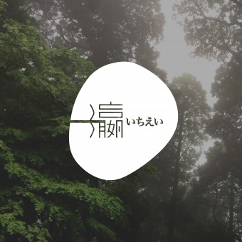
| DESIGN NAME: Ichiei PRIMARY FUNCTION: Brand Identity INSPIRATION: ichiei engaged in health food agents, the company philosophy for the "beautiful health from the beginning of eating habits". Loquat is a highly potent plant, since ancient times has been used by traditional Chinese medicine and folk therapy, the product used in Japan Kagoshima loquat leaves, made by the patent system approved by Kagoshima government. UNIQUE PROPERTIES / PROJECT DESCRIPTION: To cope with the main sales market for the Chinese mainland, Hong Kong and Macao high-end customers, the design will be the state of tea into a poetic realm, the tea leaves scattered in Japan's land form, with the simplistic and stylish way to interpret a kind of health and lifestyle of Teaism. OPERATION / FLOW / INTERACTION: ichiei company name in Chinese pronounces Yat Ying, Yat is Chinese word ONE, the ONE shape represented by the horizontal line plus Japanese name next to it. Also Ying means ocean in Japan, the part of Ying using a simply water curve instead of 3 dots. The logo's shape showcases the shape of loquat fruit. PROJECT DURATION AND LOCATION: The project started in June 2016 and finished in August 2016 - Hong Kong. FITS BEST INTO CATEGORY: Graphics, Illustration and Visual Communication Design |
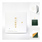
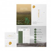
PRODUCTION / REALIZATION TECHNOLOGY: Adobe software for the logo and all printed documents. Production for the packaging produced by 350g art-card with matte lamination. Leaflet produced by 128g glossy paper. Thank you card produced by 250g matte art card. Poster produced by 128g glossy paper. SPECIFICATIONS / TECHNICAL PROPERTIES: Small Tea Package size is Width 12 cm x Depth 12 cm x Height 12 cm, Big Tea Package size is Width 17 cm x Depth 6 cm x Height 20.5 cm, Leaflet open size is A4, folded size is A5. Thank you card size is 5.4cm x 9cm. Poster size is A2. TAGS: logo, identity, branding, symbol, tea, packaging design, leaflet, high-end, simplism RESEARCH ABSTRACT: Research for the loquat fruit and loquat leaves shapes, the style of Japan simplism, how to use white color well to build up the product identity style. Client provided their Japanese farm picture to us, those pictures are full of peacefulness, elegant and pure spirit, same as their concept of the product producing. I want to enhance the product identity to promote a new way of enjoying tea and healthy, feeling the mood of the company spirit by just look at the package. CHALLENGE: Ying is a Chinese word that has lots of strokes, a logo aimed to be as simple as it can for target audience easy to identify, so it takes time to modify the way of writing. ADDED DATE: 2018-02-26 10:26:17 TEAM MEMBERS (1) : IMAGE CREDITS: Nova Hung |
||||
| Visit the following page to learn more: http://chatterdesign.com/ | |||||
| AWARD DETAILS | |
 |
Ichiei Brand Identity by Nova Hung is Winner in Graphics, Illustration and Visual Communication Design Category, 2017 - 2018.· Press Members: Login or Register to request an exclusive interview with Nova Hung. · Click here to register inorder to view the profile and other works by Nova Hung. |
| SOCIAL |
| + Add to Likes / Favorites | Send to My Email | Comment | Testimonials | View Press-Release | Press Kit | Translations |


