IGPizza Corporate Identity by Emanuele Grittini & Giuseppe Liuzzo |
Home > Winners > #65396 |
 |
|
||||
| DESIGN DETAILS | |||||
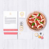
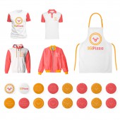
| DESIGN NAME: IGPizza PRIMARY FUNCTION: Corporate Identity INSPIRATION: The brand identity has been influenced a lot by the patterns derived from the shapes that are visualized on a pizza, this has led us to create different textures useful for the realization of the corporate materials and the layout of the location. In addition, the extreme friendly aspect has led us to design a pizza that is smiling like a pigeon, with a tongue that comes out of its mouth as a sign of liveliness and sympathy. UNIQUE PROPERTIES / PROJECT DESCRIPTION: IGPizza was created to revolutionize the world of takeaway pizza, bringing the experience of the best italian gourmet restaurant directly to your home, at work, in the park or anywhere else you like. The brand has two aspects that characterize it, first of all concerning the products used to create the pizza, these are all of the highest quality and come from agricultural holdings of excellence with certification. Secondary aspect is the friendly and welcoming aspect of the brand, which requires it to be different from competitors by offering a tailored service and close to the customer proposing innovations and attention to detail. OPERATION / FLOW / INTERACTION: The interaction with the brand identity takes place in different phases, first of all, the user's use of the menus and the packaging that contains the pizza, these materials have been specifically designed to be friendly and communicative, bringing to the consumer all the souls of the brand and its vision. Secondly, the user with the social part, specifically designed to respect the corporate graphic coordinated and to make the published contents interesting and visible. Finally, the brand interacts with its users at the point of sale and in the materials associated with it, here the environment has been designed to allow the brand's client to immerse himself in his essence so that he can appreciate its peculiarities and understand its principles. PROJECT DURATION AND LOCATION: The project start in July 2016 in Milan and finished in December 2016 in Milan. FITS BEST INTO CATEGORY: Graphics, Illustration and Visual Communication Design |
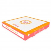
PRODUCTION / REALIZATION TECHNOLOGY: The project was realized through the use of various printing techniques, from flexography for pizza packaging to screen printing with Pantone colors for the flyer menu. As a project approach, participatory planning was implemented to involve the client in the selection phase and to better understand the decisions taken and the direction followed. SPECIFICATIONS / TECHNICAL PROPERTIES: The packaging structure that contains the pizza has been chosen among some of the best on the market and meets all the needs in terms of product protection as per ISO guidelines. The graphics applied to the box were made to make the whole inherent to the brand with the aim of communicating it to the best and allowing inclusion of communication elements such as links to social media, promotional texts and explanation on how to place the order via the website of the brand. TAGS: Friendly, pizza, food, colorful, funny RESEARCH ABSTRACT: The flow of design was based on the search for a friendly and "greedy" image that represented the values of the brand, the goal was to be represented of haute cuisine but with a friendly and playful appearance. The result has allowed the brand to be very characteristic and to be always reconfortable, becoming in a short time an icon of the same and its peculiarities. CHALLENGE: It was very difficult to represent the brand and its so many different souls in a single graphic sign that made it recognizable and different from its competitors, and the processing of pizza delivery materials was complex as they can only be printed with certain techniques that do not possess a high degree of resolution and precision, to remedy the problem we have carried out an extensive research on the most suitable technique and compatible with the design and redesigning the packaging several times to obtain the result. ADDED DATE: 2018-02-25 13:17:00 TEAM MEMBERS (2) : Graphic Designer & Art Director: Emanuele Grittini and Graphic Designer & Art Director: Giuseppe Liuzzo IMAGE CREDITS: Emanuele Grittini & Giuseppe Liuzzo, 2017. |
||||
| Visit the following page to learn more: https://goo.gl/Kc8Ry1 | |||||
| AWARD DETAILS | |
 |
Igpizza Corporate Identity by Emanuele Grittini & Giuseppe Liuzzo is Winner in Graphics, Illustration and Visual Communication Design Category, 2017 - 2018.· Read the interview with designer Emanuele Grittini & Giuseppe Liuzzo for design IGPizza here.· Press Members: Login or Register to request an exclusive interview with Emanuele Grittini & Giuseppe Liuzzo. · Click here to register inorder to view the profile and other works by Emanuele Grittini & Giuseppe Liuzzo. |
| SOCIAL |
| + Add to Likes / Favorites | Send to My Email | Comment | Testimonials | View Press-Release | Press Kit |
Did you like Emanuele Grittini & Giuseppe Liuzzo's Graphic Design?
You will most likely enjoy other award winning graphic design as well.
Click here to view more Award Winning Graphic Design.


