DESIGN NAME:
Well of Light
PRIMARY FUNCTION:
Residential
INSPIRATION:
With a core concept central to human and nature significance, the simplified design principle is anchored on return to the fundamental of space, with which the living paradigm of the occupants is synergized, in crystallized spatial disposition. As unbounded by the conventional imaginative process, we use simple and flowing circulation layout to create a comfortable and spacious ambiance, while bringing in light and view to formulate the interior spatiality in its endless visual depth.
UNIQUE PROPERTIES / PROJECT DESCRIPTION:
As this project is situated in the enchanting Yang-Ming Mountain, we opted to capitalize on its exceptionally ample light in crafting a harmonious dialogue between human, space and natural environment. The public domain is an open space demarcated with various floor elevations so as to allow poured in light to diffuse throughout various parts of space, while creating independent spatial usage with visual access interwoven in between, an essential domain for family gathering.
OPERATION / FLOW / INTERACTION:
The corridor is, more often than not, an overlooked aspect in general design, as we believe it not just being a transitional space but also a space of flexibility for recreational events.
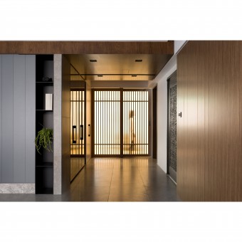
As multi-functional spaces are demarcated by wooden grill sliding door, we allow the interior domains to be flooded with sunlight, and giving rise to an innate serene ambiance, as well as, to a well-ventilated and bright quality environment; The long corridor extended from the entrance, permeated with visual aesthetics of purity in its materiality and color-tones. Furthermore, we precisely plan the width of corridor so that this area of flexibility is also part of the space of recreation, for the enjoyment of family members.
PROJECT DURATION AND LOCATION:
November, 2017
Taipei, Taiwan
FITS BEST INTO CATEGORY:
Interior Space and Exhibition Design
|
PRODUCTION / REALIZATION TECHNOLOGY:
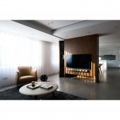
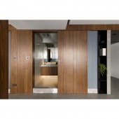
The back-wall to the living room couch is given a wooden material vocabulary and clean-cut grooved lining depicting an elevation of modern culture, as the partitioning at the overlapping section of public and private domains is matched with grey-blue and timber colors to give a clean visual of the corridor, and shaping an elegant interior vista.We extend the wooden materiality and its visual warmth into the bedrooms, where wardrobe door panels are cladded with bright-colored wooden skin which injects a refreshing energy into a tranquil resting ambiance; Through exquisite masonry texture, we shape the bathroom space with the star-class hotel aesthetics, by using white rock-face tile instead of marble to achieve anti-slippery effect.
SPECIFICATIONS / TECHNICAL PROPERTIES:
The interior space is of 120 square meters in area, and through our meticulous layout and circulation planning, we maximize spatial visual depth to give the owner a care-free living stage.
The space is centered on a large visible column which dictates the planning of bathroom and storage spaces, as we meticulously highlight the structural element as an aesthetics advantage, and having multiple materials deployed to achieve an overall consistency that renders the intermediate space to be the node of emotional transition.
TAGS:
-
RESEARCH ABSTRACT:
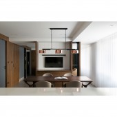
As the owner of this project is a near-retirement couple, living abroad most of the time, hence very much cherishes the time spent with families, we opted for an open-planning spatial strategy to shape a network of multi-functional spaces of flexibility and interconnectivity, so as to indulge family members for a free and interaction-rich living ambiance, while we plan large glass area for living and kitchen-dining rooms to creatively allow exterior view flowing into the interior, the boundary between the urban and the natural being slowly decimated.
From the view of overall composition and structure, the interior space is broadened with panoramic spatiality and shortened corridor width, before generating an articulate visual axis, epitomizing a strong asset value. In terms of design stylistics, we use an elegant pure white-color base, interwoven with warm visual texture of wooden materiality, and with a simple design vocabulary to induce a fresh and delicate sense of space. With articulation of exquisite materiality, and modulated color progression styling, we bestow upon the interior with much flexibility and scale, while amalgamating perfectly the grandeur of the commercial living and the aesthetics of the refined and the sophisticated.
CHALLENGE:
With the original crowded layout, and spatial fragments created by the large central column, while unnecessarily elongated corridor space accentuated the poor illumination and over-consumption of spatial utility. Therefore, by breaking away from all types of preconceived notions and boundaries, we freed up the domain spatiality by deploying a sensible layout, which contained the large column within the private domain, which, in turn, opened up bathroom and storage spaces, in matching the expectations and imaginations of the owner couple towards their ideal home.
ADDED DATE:
2018-02-21 03:08:05
TEAM MEMBERS (1) :
Pei-Lin,Hsieh
IMAGE CREDITS:
Pei - Lin Hsieh, 2017.
|


