Santaren Rum Bottle by Estudio Maba |
Home > Winners > #64498 |
 |
|
||||
| DESIGN DETAILS | |||||
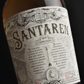
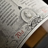
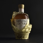
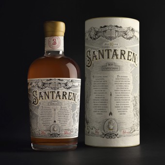
| DESIGN NAME: Santaren PRIMARY FUNCTION: Rum Bottle INSPIRATION: A narrative design inspired by old engraving graphics. In search of its own personality, the design of Santaren moves away from tendencies to approach the treatment of ancient Alchemy books. In the same way that the rum waits patient 10 years its aging, this bottle is immersed in ancient tradition. UNIQUE PROPERTIES / PROJECT DESCRIPTION: Santaren is the result of the silent, dark, patient maceration of plants and spices. A delicately spiced gourmet rum, it represents the coming together of the Mediterranean, the Caribbean and the River Demerara. In this project, the clear objective was to make the design eminently original, to endow the bottle with all the elegance, personality and refinement of the liquid it contains, a liquid serenely distilled, full of feeling and history. OPERATION / FLOW / INTERACTION: The bottle is held within a thoughtfully decorated canister and protected by silky golden paper that gradually uncovers the treasure: a gourmet bottle of spiced rum which has waited for 10 years for the perfect moment to be bottled. It transmits the calm elegance of the distilling process as its amber hues contrast delicately with its superb packaging of lush texture. PROJECT DURATION AND LOCATION: From november 2016 to March 2017 FITS BEST INTO CATEGORY: Packaging Design |
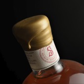
PRODUCTION / REALIZATION TECHNOLOGY: Digitally printed pure cotton paper label, gold foil stamping, embossing and puff ink. SPECIFICATIONS / TECHNICAL PROPERTIES: 110 X 110 X 230 mm bottle 120 X 120 240 mm cannister TAGS: Rum, packaging, classic, design RESEARCH ABSTRACT: The graphic approach for the label was classical, employing engraving techniques to create an image on heavily textured cotton paper. Ornamental typeface, luxurious detail and biblical symbols were incorporated to narrate the martyrdom of Saint Irene of Thessalonica, a young virgin put to death for hiding the Holy Scriptures. A refined, elegant design. A delightful project. CHALLENGE: Decisions regarding the amount of narrative that was to be included in the label, there being such a story in the name itself, took up many hours in the creative process. Once the story had been formed, the greatest challenge came with the illustration, which employed ancient printing techniques and digital illustration. These two combined perfectly and produced excellent results. The choice of types of paper and finish is also an essential part of the project: it expresses its proud character through cotton-like textures, stamping and embossing. ADDED DATE: 2018-02-20 09:34:58 TEAM MEMBERS (3) : Concept: Miguel Ángel del Baño, Beatriz Suárez, Graphic Design: Miguel Ángel del Baño and Illustration: Borja Torres, Miguel Ángel del Baño IMAGE CREDITS: Estudio Maba |
||||
| Visit the following page to learn more: http://estudiomaba.com/trabajos/ron-sant |
|||||
| AWARD DETAILS | |
 |
Santaren Rum Bottle by Estudio Maba is Winner in Packaging Design Category, 2017 - 2018.· Press Members: Login or Register to request an exclusive interview with Estudio Maba. · Click here to register inorder to view the profile and other works by Estudio Maba. |
| SOCIAL |
| + Add to Likes / Favorites | Send to My Email | Comment | Testimonials | View Press-Release | Press Kit |

