Way of Knowledge Book Design by Yuta Takahashi |
Home > Winners > #64419 |
 |
|
||||
| DESIGN DETAILS | |||||
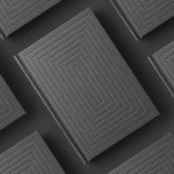
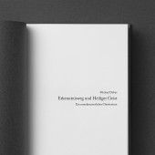
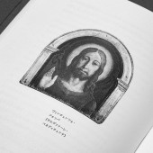
| DESIGN NAME: Way of Knowledge PRIMARY FUNCTION: Book Design INSPIRATION: Inspired by the designs of cloisters and leather bound bibles found in churches and the images of doors we imagine when we visualize the human thought process, we decided to combine these images in a modern way. Because our readers are researchers well versed in their fields, we also took inspiration from the writing implements and notebooks used by our readers on a regular basis. UNIQUE PROPERTIES / PROJECT DESCRIPTION: We designed book for "The Way of Knowledge and the Holy Spirit", by Michael Debus. Making full use of philosophical thought, the author tries to take the myths that have been handed down from ancient times and make them understandable to modern people. We visually expressed the progress of the author's thoughts as he wrote this book. This opens a door on his multi-layered thoughts and indicates the intention of this book to bring out the essence of the myths which have been wrapped in a veil. OPERATION / FLOW / INTERACTION: Our readers will conduct years of research with this book in hand. Therefore, we felt that we needed to create a design that wouldn't look out of place, no matter where in a reader's living space it was put a bookshelf, a desk drawer, wherever. By designing this book to be a part of readers' interiors, we have created a book that suits their living spaces and lifestyles. PROJECT DURATION AND LOCATION: This project began in Japan in May of 2017 and ended in July 2017. The sale of books has been started in Japan since July 2017. FITS BEST INTO CATEGORY: Graphics, Illustration and Visual Communication Design |
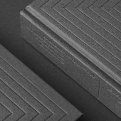
PRODUCTION / REALIZATION TECHNOLOGY: The cover design was created using only blind embossing. In order to make the title stand out, we performed blind embossing twice on the front cover, spine, and back cover, creating a shadow-like texture that stands out from the bumpy surface. We used this double embossing method because creating deep impressions in one go could rip the paper. We also used paper suitable for embossing for the cover. SPECIFICATIONS / TECHNICAL PROPERTIES: Hardcover book, 194mm x 136mm x 37mm, 392page, Blind emboss processing twice on cover, spine and back cover. TAGS: book, design, editorial, graphic, typography, emboss, minimal, japan RESEARCH ABSTRACT: We researched the ecosystems of all kinds of books from the books lining bookstore shelves to leather bound bibles. We then considered what kind of book our readers could keep on hand as they conduct many years of research. We created this design after considering how the book would feel when held and its usability. CHALLENGE: By introducing shadow into our design, we added a new element to conventional graphic design, creating a challenge for ourselves. By creating a shadow effect using embossing alone, we were able to create a design that transcends two dimensions. ADDED DATE: 2018-02-19 10:24:24 TEAM MEMBERS (1) : IMAGE CREDITS: Image #1: Photographer Yuta Takahashi, 2017 Optional Image #1: Photographer Yuta Takahashi, 2017 Optional Image #2: Photographer Yuta Takahashi, 2017 Optional Image #3: Photographer Yuta Takahashi, 2017 Optional Image #4: Photographer Yuta Takahashi, 2017 |
||||
| Visit the following page to learn more: http://www.yutatakahashi.jp | |||||
| AWARD DETAILS | |
 |
Way of Knowledge Book Design by Yuta Takahashi is Winner in Graphics, Illustration and Visual Communication Design Category, 2017 - 2018.· Press Members: Login or Register to request an exclusive interview with Yuta Takahashi. · Click here to register inorder to view the profile and other works by Yuta Takahashi. |
| SOCIAL |
| + Add to Likes / Favorites | Send to My Email | Comment | Testimonials | View Press-Release | Press Kit |


