Chips BCBG Food packaging by D. Goyon, R. Vicente and C. Alamy |
Home > Winners > #64209 |
 |
|
||||
| DESIGN DETAILS | |||||
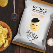
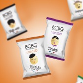
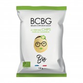
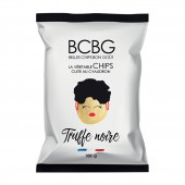
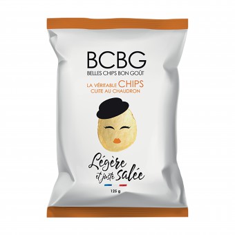
| DESIGN NAME: Chips BCBG PRIMARY FUNCTION: Food packaging INSPIRATION: Our agency was inspired by clean and impacting packaging, especially from the United Kingdom. We also take a lot of inspiration from packaging from Favorite Design. UNIQUE PROPERTIES / PROJECT DESCRIPTION: The brand of BCBG craft chips offers top quality manufacturing with great creativity of recipes and flavors. The new range is based on a series of characters in the shape of chips which illustrates the recipe of each product with a fun and warm tone. OPERATION / FLOW / INTERACTION: Chips are made in France with natural products. No coloring, no preservatives. PROJECT DURATION AND LOCATION: A few months have allowed the realization of the whole range of crisps. Crisps are now distributed in all SNCF bar wagons, but also at Carrefour, Intermarché and Monoprix. FITS BEST INTO CATEGORY: Packaging Design |
PRODUCTION / REALIZATION TECHNOLOGY: The graphics used for the range of chips is a clean and impacting graphic. The lightness given to packaging connotes the product as a natural product, healthy and authentic. Each product is represented by a friendly character. SPECIFICATIONS / TECHNICAL PROPERTIES: Le packaging mesure 20 cm de large x 30 cm de haut. TAGS: chips, design, packaging, minimal RESEARCH ABSTRACT: We first thought about a range of characters corresponding to each product in the range. Then we drew with Illustrator and adapted them according to the product. CHALLENGE: Modernize the range without losing customers ADDED DATE: 2018-02-16 11:09:52 TEAM MEMBERS (3) : Delphine Goyon : Art Director & Graphist, Remi Vicente : Director of the agency and Catherine Alamy : Graphist IMAGE CREDITS: D. Goyon, R. Vicente and C. Alamy, 2017. |
||||
| Visit the following page to learn more: http://lc.cx/P6Cb | |||||
| AWARD DETAILS | |
 |
Chips Bcbg Food Packaging by D. Goyon, R. Vicente and C. Alamy is Winner in Packaging Design Category, 2017 - 2018.· Press Members: Login or Register to request an exclusive interview with D. Goyon, R. Vicente and C. Alamy. · Click here to register inorder to view the profile and other works by D. Goyon, R. Vicente and C. Alamy. |
| SOCIAL |
| + Add to Likes / Favorites | Send to My Email | Comment | Testimonials | View Press-Release | Press Kit | Translations |

