Homemade Cafe Snack bar by Gravity Design Team |
Home > Winners > #63970 |
 |
|
||||
| DESIGN DETAILS | |||||
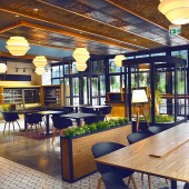
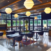
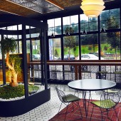
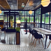
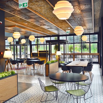
| DESIGN NAME: Homemade Cafe PRIMARY FUNCTION: Snack bar INSPIRATION: Design is inspired by the natural surrounding of the cafe where located in a green area of Istanbul a little bit far from the central points, and which helps people to escape from the city chaos and breathe the fresh air. We wanted to carry this natural and relaxing environment to the interior design by creating a spacious atmosphere with natural elements while presenting the premium quality of the brand with a modern look in the best possible way. Our main goal was to create an environment for celebration of the best homemade food that the grocery store supplies, while providing a meeting spot for the community both for leisure and work. UNIQUE PROPERTIES / PROJECT DESCRIPTION: Homemade Cafe is a new concept of the brand, Macrocenter, which is one of biggest premium local grocery store chains in Turkey. The cafe is integrated to the supermarket to serve daily their fresh, homemade products while making their guests enjoy the cosy atmosphere and natural surrounding. The cafe offers a self-service food cart where customers can order and pay quickly for their meal, and eat at the table enjoying the calm and relaxed atmosphere in company with the special tastes. Most of the furnitures used in design were custom-made. The cafe is also convenient for business meetings. OPERATION / FLOW / INTERACTION: Homemade Cafe can be considered as both a grab and go snack bar and a premium cafe with its high quality design elements with use of diverse materials in a meaningful harmony. PROJECT DURATION AND LOCATION: The project started in September 2017 and finished in December 2017 in Istanbul. FITS BEST INTO CATEGORY: Interior Space and Exhibition Design |
PRODUCTION / REALIZATION TECHNOLOGY: A part of the parking lot of the mall was designated to create this cafe, so we built all the walls, flooring, ceiling and the facade elements from scratch. Main materials are wood which are used in furniture and ceiling; sheet metal panels and fibre panels on the ceiling; white ceramics on the wall; handmade tiles, concrete and epoxy materials on the floor; and a vertical green wall at the open-air area. Each of the lightings were custom-made, as well as the tables and hand-knotted carpets. SPECIFICATIONS / TECHNICAL PROPERTIES: The project is realized in a 200 square meters area in Vadistanbul, which is a rising shopping mall of the city. The used materials are 60 square meters sheet metal panels and 60 square meters fibre panels on the ceiling; 40 square meters white ceramics on the wall; 80 square meters handmade tiles, 120 square meters concrete and epoxy on the floor; 18 square meters vertical green wall in the open-air area. TAGS: snack bar, cafe, supermarket, restaurant, coffee place RESEARCH ABSTRACT: First, the design and communication language of the brand was deeply observed. The interior design elements, used materials and forms of the grocery store were identified. The products and delicatessens sold at the cafe were studied. The customer profile and behaviours were examined through well structured interviews and observations. The outside environment of the cafe was observed. All these data were combined to create a fresh design resulting in a harmony of colours, forms and material combinations, while meeting the user needs in a smart way. CHALLENGE: The biggest challenge was the limited time for production of custom-made materials such as lightings, tables and choosing the best elements like the right carpet and the plant to create the unique cosy atmosphere. For some specific elements, special mould system was required. ADDED DATE: 2018-02-12 08:29:58 TEAM MEMBERS (1) : Gravity Design Team IMAGE CREDITS: All photos are taken by Gravity Design Team. |
||||
| Visit the following page to learn more: http://gravity-tr.com/en | |||||
| AWARD DETAILS | |
 |
Homemade Cafe Snack Bar by Gravity Design Team is Winner in Interior Space and Exhibition Design Category, 2017 - 2018.· Press Members: Login or Register to request an exclusive interview with Gravity Design Team. · Click here to register inorder to view the profile and other works by Gravity Design Team. |
| SOCIAL |
| + Add to Likes / Favorites | Send to My Email | Comment | Testimonials | View Press-Release | Press Kit |

