Mangata Patisserie Bakery Visual Identity by M — N Associates |
Home > Winners > #63744 |
 |
|
||||
| DESIGN DETAILS | |||||
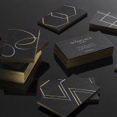
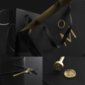
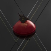
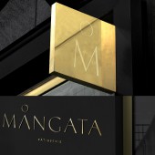
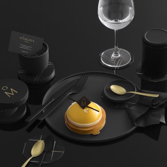
| DESIGN NAME: Mangata Patisserie PRIMARY FUNCTION: Bakery Visual Identity INSPIRATION: Mangata Patisserie launched to be one the luxury bakeries in Saigon serving truly well-designed cakes with high-tea concept. The owner has been wandering, researching and studying for a long time in French and Belgium to find the-one recipes. Endorsing the minimal lifestyle of Northern Europe, the name is chosen for its unique meaning, a feeling for falling in love, romantic and delight, like a beautiful novel, a love song, something comes without thoughts but from the bottom of hearts. UNIQUE PROPERTIES / PROJECT DESCRIPTION: The concept is mainly focus to create a visual identity and system for packaging and other brand materials that is unique, strong and sustainable. Mangata has a different meaning in Swedish, a unique romantic scene : the glimmering, road-like reflection of the moon creates on the night sea. The scene is really inspired and visually appealed, so we brought it into the brandmark, making Mangata more unique and memorable but not overwhelmed its content. The colour palette, black & gold, imitates the atmosphere of the dark sea, also, gave the brand a mysterious, luxury touch. OPERATION / FLOW / INTERACTION: The luxurious black vibe enter the market strangely in Vietnam, giving it a curious entrance, and interesting point of view for dessert industry. And to give a contrast point of view about execution, the system was build upon a dynamic visual system, making personal feeling for each customers becomes an unique interaction with the brand. PROJECT DURATION AND LOCATION: The project was started in June 2015 and launched completely in August 2015. FITS BEST INTO CATEGORY: Graphics, Illustration and Visual Communication Design |
PRODUCTION / REALIZATION TECHNOLOGY: Silk-printed multiple layers for gold, silver and white on black matte art paper. SPECIFICATIONS / TECHNICAL PROPERTIES: Basic stationery system for classic feeling but goodness is about the touch and look. Due to the touch of thin, elegant visual system, all the business card was gold-edged painting. TAGS: mangata patisserie, bakery, visual identity, branding, black, vietnam, saigon, sweet, confectionery, ho chi minh city RESEARCH ABSTRACT: The contemporary art of plating is exploding with so many new creation and design, but it all comes from geometric-based concept with various type of geometric cutters and molds. The visual system was developed and applied dynamically for brand materials, involving a personal touch to Mangata. CHALLENGE: The huge challenge is launching at a time that high-tea concept and serve well-plating patisserie was still new to the market. ADDED DATE: 2018-02-06 10:37:18 TEAM MEMBERS (3) : Creative Director : Duy — N, Project Manager : M — Lan and Production : Cropmarks IMAGE CREDITS: Photographer & Stylist : Deto |
||||
| Visit the following page to learn more: http://m-n.associates | |||||
| AWARD DETAILS | |
 |
Mangata Patisserie Bakery Visual Identity by M — N Associates is Winner in Graphics, Illustration and Visual Communication Design Category, 2017 - 2018.· Press Members: Login or Register to request an exclusive interview with M — N Associates. · Click here to register inorder to view the profile and other works by M — N Associates. |
| SOCIAL |
| + Add to Likes / Favorites | Send to My Email | Comment | Testimonials | View Press-Release | Press Kit | Translations |

