Charlotte's Home Residential House by Ding-Rui Tai |
Home > Winners > #63535 |
 |
|
||||
| DESIGN DETAILS | |||||
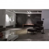
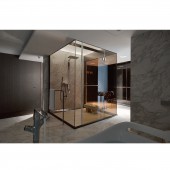
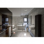
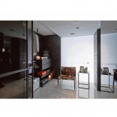
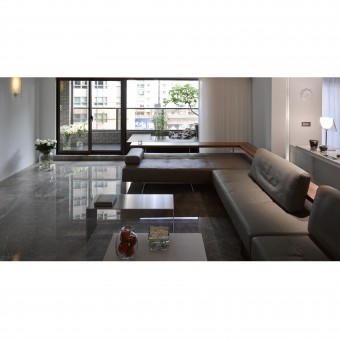
| DESIGN NAME: Charlotte's Home PRIMARY FUNCTION: Residential House INSPIRATION: To design a Charlotte style's home. Charlotte grows in a nobility family and is a lover of art. Her face looks delicate and personality is graceful. She is the most conservative and traditional person among friends and desires the romance of soul. Pursuing perfection and fashion, looking into details and sensitive to things are her style. She desires to build a lovely home with her kids. Family shares a big space. We value the flexibility of space and utilize the intangible sunlight and shadow to segment the space. Collection of arts placed anywhere is a great performance. Life is an art. UNIQUE PROPERTIES / PROJECT DESCRIPTION: The property owner in this case is a couple of doctors, and they themselves and their view towards life are the combination of elegance and rationality. The case emphasizes, as a whole, the basis of space and the presentation of light. After entering the door, one cannot see the porch and the shoe cabinet all at once. What is in sight is a very complete expression of space. In fact, we made a hidden door by the side to meet the needs of life. OPERATION / FLOW / INTERACTION: According to the homeowners usage habit, there is no difference between Chinese style and Western style kitchens, but a stir fry area and a bar zone. In the bathroom of master bedroom, through glass and by means of light and shadow, one perceives the attention paid to an individual from the space while being there, as if someone walks on the runway with spotlight on him or her. I hope to make a good use of the vocabulary of light and shadow in such a particular site as dressing and bathing space. PROJECT DURATION AND LOCATION: The project started in July 2012 in Taiwan, and finished in March 2013. FITS BEST INTO CATEGORY: Interior Space and Exhibition Design |
PRODUCTION / REALIZATION TECHNOLOGY: In color, the pure white color matched with light tan, coffee color expresses the taste of art. The whole house is felt warm by adding gentle, wooden color. In living room, the extension of L model sofa let the space is felt wider. For the master bathroom, the streamline bathtub and washbowl, pure stone floor and wall, and modern style of crystal chandelier express simple but not monotonous, gorgeous but not poor taste. SPECIFICATIONS / TECHNICAL PROPERTIES: Three rooms and living room, dining room. Total area: 260sqm TAGS: DINGRUI, Interior, Taiwan, Residential House, Ding-Rui Tai RESEARCH ABSTRACT: In design, we often study the behaviors of people, hoping that their needs and problems encountered in each space can be solved. For instance, a steam room bench installed in the bathroom and some armrests of versatile features cannot only be used to place towels but protect personal security as well. CHALLENGE: In particular, we pay attention to the good relations between the order in life and the space, which often leads to different patterns of behavior. If we turned a blind eye to some unreasonable points in design, they might not be evident for a short period of time, but in the long run, the homeowners life would be likely to get messy. On the contrary, if the design is accurate about commanding the order of life, then the house is graced both outside and inside. Such a house is a healthy one. Living in such a house is a healthy life. ADDED DATE: 2018-01-30 10:58:32 TEAM MEMBERS (1) : Ding-Rui Tai IMAGE CREDITS: Kuo-Min Lee |
||||
| Visit the following page to learn more: http://www.ding-rui.com | |||||
| AWARD DETAILS | |
 |
Charlotte's Home Residential House by Ding-Rui Tai is Winner in Interior Space and Exhibition Design Category, 2017 - 2018.· Press Members: Login or Register to request an exclusive interview with Ding-Rui Tai. · Click here to register inorder to view the profile and other works by Ding-Rui Tai. |
| SOCIAL |
| + Add to Likes / Favorites | Send to My Email | Comment | Testimonials | View Press-Release | Press Kit |

