Kyonavi Tourist Information Center by Junichiro Azuma |
Home > Winners > #63448 |
 |
|
||||
| DESIGN DETAILS | |||||
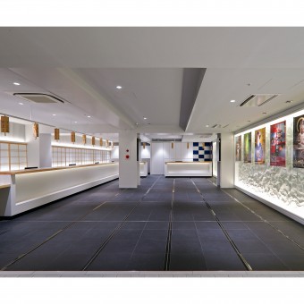
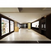
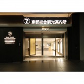
| DESIGN NAME: Kyonavi PRIMARY FUNCTION: Tourist Information Center INSPIRATION: For this project we aimed to provide an Essence of Kyoto for the visitors, both Japanese and foreign. To do this, we tried to incorporate the traditional Japanese aesthetics of natural beauty and Sukiya style. Wrinkled aluminum mimicking paper, and black granite tiles in place of tatami mats, we also experimented with modern materials used in a novel way to pay homage to traditional Japanese architectural design. We tried to discovered a hidden Japanese beauty in functional modern materials. UNIQUE PROPERTIES / PROJECT DESCRIPTION: The Kyoto Tourist Information Center is a new tourism information center operated by the city and prefecture of Kyoto located in the Entrance to Kyoto, Kyoto Station. Our aim was to make it a fitting starting point to the International Tourist City, Ancient Kyoto. We attempted to organize the abundant and various types of information to be easily understood and useful for visitors. The space is functional yet contains the spirit of Kyoto and traditional Japanese design. OPERATION / FLOW / INTERACTION: The Tourist Center is a place tourists visit before going to their destinations in the city. Upon leaving they will visit the real Kyoto destinations. For this reason we did not want the Tourist Center to feel fake in comparison. We wanted the visitors to experience the essence of Kyoto from the beginning. PROJECT DURATION AND LOCATION: 2F of JR Kyoto Station Building, Shimogyo-ku Kyoto-shi, Kyoto OPEN:MARCH 2010 FITS BEST INTO CATEGORY: Interior Space and Exhibition Design |
PRODUCTION / REALIZATION TECHNOLOGY: The floor used tiles to mimic traditional “tatami” mats. The walls are made of rough steel plates. Wrinkled aluminum is used in place of “washi” paper. The traditional material is replaced with a modern material, yet it retains the original spirit through the common expression of wrinkles. The pattern also evokes the famous checkered pattern of the “fusuma” screens at Katsura Imperial Villa. In this way, many traditional Japanese motifs are expressed through modern materials. SPECIFICATIONS / TECHNICAL PROPERTIES: width 8,635mm x Depth 32,530mm height 2,700mm area 280sqm /Tourist Information Center 120sqm, Office 65sqm, conference room 17sqm, Stock room 69sqm. TAGS: wabi-wabi, ZEN, simplicity, MINIMUM, Japanese architecture, SUKIYA, tea-ceremony pavilion, RESEARCH ABSTRACT: Kyoto has had more than 50 million visitors in recent years. There has especially been a dramatic increase in foreign visitors. Kyoto City and Kyoto Prefecture originally operated separate Tourist Information Centers. In order to provide a better experience for visitors, it was decided to combine the facilities. Due to an increase in Asian visitors, services are provided in English, Chinese and Korean. A system consisting of signs on the counter indicate which language each staff member speaks. CHALLENGE: The original opening of the space facing the busy station was very narrow. We were concerned it would be difficult for visitors to notice the Center in these conditions. For this reason we decided to incorporate the adjacent station signage, an observation deck, and a stairway into a Tourism Information Zone. We proposed this rethinking and redesign the public space to the developer and station authorities. Our proposal was accepted and thus allowed us to greatly increase the visibility of the Center by expanding the visual facade area. ADDED DATE: 2018-01-27 03:24:04 TEAM MEMBERS (1) : Graphic design:Masaaki Hiromura (Hiromura design office) IMAGE CREDITS: Image #1: Photographer Tatsuo Hanashiro, 2010. Image #2: Photographer Tatsuo Hanashiro, 2010. Image #3: Photographer Tatsuo Hanashiro, 2010. Image #4: Photographer Tatsuo Hanashiro, 2010. Image #5: Photographer Tatsuo Hanashiro, 2010. PATENTS/COPYRIGHTS: Copyrights reserved by Junichiro Azuma & JA laboratory, 2010. |
||||
| Visit the following page to learn more: http://www.ja-labo.jp/ | |||||
| AWARD DETAILS | |
 |
Kyonavi Tourist Information Center by Junichiro Azuma is Winner in Interior Space and Exhibition Design Category, 2017 - 2018.· Press Members: Login or Register to request an exclusive interview with Junichiro Azuma. · Click here to register inorder to view the profile and other works by Junichiro Azuma. |
| SOCIAL |
| + Add to Likes / Favorites | Send to My Email | Comment | Testimonials | View Press-Release | Press Kit |


