DESIGN NAME:
Moon Two
PRIMARY FUNCTION:
Tactile Font
INSPIRATION:
I was inspired by the use of Braille used on signage as a standard. I have always touched it as I pass and wondered if their was an easier alternative tactile method. After researching and finding out about a now almost extinct tactile font called 'Moon' I decided to revive it, improving its faults, making it more accessible for a modern era. I also visited schools where Moon is still taught, and learned of the challenges that are faced by their students.
UNIQUE PROPERTIES / PROJECT DESCRIPTION:
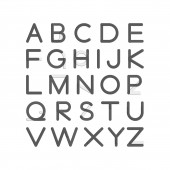
This is a redesign and revival of William Moon’s Moon typeface, combined with a custom Latin script to enable the joint learning of children with visual impairments and those with normal sight. Moon Two is a hybrid typeface for use in the educational system and at home.
It stays true to the 171 year old original in many ways, but removes the confusion that many children felt with its original rotated and mirrored shapes. This revival uses both squared and rounded terminals which aid tactile legibility by clearly signifying the beginning and end of character shapes as you read from left to right, with an optimal reading size at 20pt.
Posters which will advertise the use of Moon Two will be under the campaign name ‘Better Together’, symbolising the combination of two character sets and a coming together of children who learn either with their peers, teachers or parents. Poster colours will vary, representative of colour combinations that suit those with partial sight.
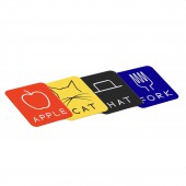
Tools such as flashcards will help younger readers learn to recognise the objects around them. The cards will be available in different coloured sets which parents can choose to suit their child’s eyesight. The use of simple words and illustrations will be recognisable to all with and without sight impairment.
Tactile story books will help broaden familiarity with Moon Two when used in conjunction with simplified illustrations. Colour combinations aim to help aid legibility for both visually impaired and sighted readers.
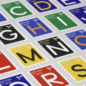
To help spread the message and demonstrate Moon Two in a simple way, stamps will be available, adding a personal touch to letter sending with a full alphabet of 26 available to collect. Each stamp features a different letter in both tactile and Latin weights of the tactile font.
An important element is a digital platform for people who are partially sighted and for those who are interested in learning about the relationship of glyphs in Moon Two. This provides an interactive way of revealing each letter. This features optional colour pairings which help the partially sighted to differentiate characters on screen. This font can also be downloaded to help spread the availability of Moon Two.
OPERATION / FLOW / INTERACTION:
This revival uses both squared and rounded terminals which aid tactile legibility by clearly signifying the beginning and end of character shapes as you read from left to right, with an optimal reading size at 20pt.
PROJECT DURATION AND LOCATION:
This project was started in January 2016 and ended in March 2016. It won both a D&AD Graphite and White Pencil in June 2016, with the design being exhibited in Brick Lane, London.
FITS BEST INTO CATEGORY:
Graphics, Illustration and Visual Communication Design
|
PRODUCTION / REALIZATION TECHNOLOGY:
First and foremost, this tactile font's point size is dictated by the size of a fingertip, as this is its primary method of reading. Print colours are devised by creating a high contrast, as this is easier to read for those who are partially sighted. The printed font is overlaid on top of the tactile font, creating a clarity for those with partial sight to read. The tactile font has no colour, but of course can be seen as slightly raised characters, which is seamlessly integrated with its printed counterpart.
SPECIFICATIONS / TECHNICAL PROPERTIES:
The font has an optimal reading size of 20pt. This is used for all tactile reading purposes against a contrasting background.
TAGS:
Tactile Font Moon Two Visual Graphic Design
RESEARCH ABSTRACT:
Research included visiting schools to determine why Moon type would be a better option for people who are blind/visually impaired, over the more conventional Braille. Learning about challenges people with sight loss face, such as isolation, was also a key factor in aiding this design outcome, as the Moon Two font can be learned at a young age with by all students in an inclusive way.
CHALLENGE:
One of the hardest challenges was to improve Moon Two from its predecessor Moon Type, by fixing many of the flaws which contributed to its lack of use. This included reversing its tactile form from concave to convex. It also required the addition of hard terminals on the right hand side of each character to better signify the end of a letter, as well as soft terminals on the left side of a character, which provides a smooth transition as you begin to read each new character.
As well as the physical changes, Moon Two had to be combined with a custom latin font, making its accessibility even greater to those who go blind in later life, or who are born with it.
ADDED DATE:
2018-01-02 16:20:23
TEAM MEMBERS (1) :
IMAGE CREDITS:
Kegan Greenfield, 2017.
|


