704 Home Design Store by Paula Werneck |
Home > Winners > #62145 |
 |
|
||||
| DESIGN DETAILS | |||||
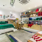
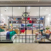
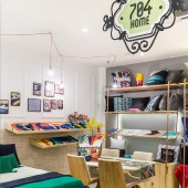
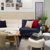
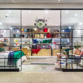
| DESIGN NAME: 704 Home PRIMARY FUNCTION: Design Store INSPIRATION: Our inspiration came from the 704 Home brand. Cool, urban and sustainable. Their products are exclusive and handmade in the Northeast of Brazil with pesticide free organic cotton. Every aspect of this design searched for different textures, colors and urban materials such as concrete, copper, pinus wood and glass. Our main objective was to translate the brand identity in the interior design. UNIQUE PROPERTIES / PROJECT DESCRIPTION: The design had as premise showing the essence of the identity of the brand 704 Home. All products in this store are handmade and very colorful, so a neutral base was created in order to show the design diversity of each product. We created a neutral atmosphere colored by the various products. A cement flooring combined with a colored wood floor that relates to the young and cool side of the brand. The shop window was designed to simulate a street store. We wanted to bring the urban feeling into the shopping mall. OPERATION / FLOW / INTERACTION: As the public passes the store, which is located inside a shopping mall, they have the impression of being outside due to the window design. We wanted to create and urban atmosphere. Inside the store, we have three different spots: a living room, a dinning room and a bedroom. Inside the store, the clients lose track of time rehearsing different combinations of home items as if they were home. They can stay as long as they want, the purpuse of the store experience is to make everyone feel at home. PROJECT DURATION AND LOCATION: The project design started in August 2017 and the store opened to the public on October 2017. Rio de Janeiro, Brazil. FITS BEST INTO CATEGORY: Interior Space and Exhibition Design |
PRODUCTION / REALIZATION TECHNOLOGY: We used different materials and textures for this design. The floor was handmande on site mixing cement and painted wood pieces. The colors chosen are the same as the summer collection products. On the walls, we chose cement bricks and polystyrene moldings to simulate classic wooden moldings. The shop windown was designed to simulate a street facade. This way we brought the urban site into the shopping mall. The store sign was made from mdf laser cut and hanged on the ceiling. And the shelves were created from pinus wood and structured from pvc pipes painted with colorjet cooper, this way we made this design possible with a low cost. SPECIFICATIONS / TECHNICAL PROPERTIES: The store has a 30sqm space with 3m height for the ceiling. TAGS: shop, retail, design, interior, architecture RESEARCH ABSTRACT: For this project, we had only two months to design and finish all the works. The project design started in August 2017 and the store opened to the public on October 2017. We had to search for a cool and low cost design due to timming and a strict budget. Also, this design had to showcase the brands identity. It was the firts store oppening. An original and low cost design was in order . For example, the shelves were made from pinus wood and structured from pvc pipes painted with cooper paint. The floor was handmade on site mixing concrete with color wooden floor. Every item was personalized. CHALLENGE: The fist challenge was to create and finish the design in less than two months with a very strict budget. The project started on August 2017 and the store opened in October 2017. Therefore, an original and low cost design was in order . For example, the shelves were made from pinus wood and structured from pvc pipes painted with cooper paint, reducing the overall cost. The floor was handmade on site mixing concrete with color wooden floor. Although the cost was reduced with these items, the final design matched perfectly with the brand's identity. Urban and sustainable. ADDED DATE: 2017-11-01 10:48:54 TEAM MEMBERS (1) : Paula Werneck IMAGE CREDITS: Luciano Mendes |
||||
| Visit the following page to learn more: http://bit.ly/2zbwErN | |||||
| AWARD DETAILS | |
 |
704 Home Design Store by Paula Werneck is Winner in Interior Space and Exhibition Design Category, 2017 - 2018.· Press Members: Login or Register to request an exclusive interview with Paula Werneck. · Click here to register inorder to view the profile and other works by Paula Werneck. |
| SOCIAL |
| + Add to Likes / Favorites | Send to My Email | Comment | Testimonials | View Press-Release | Press Kit |

