Weave Plugin by Gissoo Doroudian |
Home > Winners > #61767 |
 |
|
||||
| DESIGN DETAILS | |||||
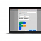
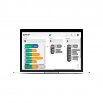
| DESIGN NAME: Weave PRIMARY FUNCTION: Plugin INSPIRATION: Three years ago, I was working on a project, in which I had to design and implement a mobile application. Soon, I began to have many internal conversations questioning my logic and priorities. I realized there was a major disconnect with my vision for the application, its values and potentials versus what could have been possible to build into a functional product. I thought, I was the only one involved in this project and I had these many internal conversations, what would it look like if there was more than one person involved? UNIQUE PROPERTIES / PROJECT DESCRIPTION: With Weave designers and developers can: Learn about each others’ logic and approach. Propose changes to the system together vs. working through written feedback. Collaborate in their workflows as part of their natural process, because the foundation of this collaboration is grounded in the co-creation of system architecture. Document their entire process on a contextual level so that they can have access to everything in the future when needed. Develop mutual trust in their collaborations. OPERATION / FLOW / INTERACTION: Designer would place a user scenario in the system by inputting verbs, system parts and functions, while inputting what the scenario enables the user to do and its goal for documentation purposes. The scenario is turned into a map using natural language processing. Once shared with the developer she can propose changes to the architecture by adding actions, or variations to each map beyond the user scenario that was created in order to help her to frame her code. PROJECT DURATION AND LOCATION: Weave began in September 2018 in Detroit, Michigan, and finished in April 2018 in Detroit, Michigan, and was exhibited at the student exhibition of the College for Creative Studies in May 2018. FITS BEST INTO CATEGORY: Interface, Interaction and User Experience Design |
PRODUCTION / REALIZATION TECHNOLOGY: The most important technique used for coming up with the design of Weave was the study of Unified Modeling Language, which is one language used in software development to map information when designing a system. After I developed a better understanding of Unified Modeling Language and aligned it with goals of Weave I began to conduct usability testing with a low-fidelity design of an information mapping workflow with both designers and developers to better understand their approaches when mapping information. SPECIFICATIONS / TECHNICAL PROPERTIES: Weave is a platform which enables designers and developers to begin their collaboration at the beginning of projects, before any design decisions are made, by co-creating the system architecture. Designers use Weave as a plugin within interface prototyping tools, and developers can use Weave through its web app. Designers can turn user scenarios into system maps of the product which become the basis for their collaborations with developers and links to design-related documents in the system. TAGS: Collaboration, Interaction Design, Software Developement, Rethinking Collaboration, Rethinking Workflows, Agile, Rethinking Collaboration RESEARCH ABSTRACT: Problem with the existing tools and their solutions There are three major problems with how interface prototyping tools are currently addressing designer-developer collaboration issues. Following are the three major problems caused by the existing tools and their solutions: 1. They encourage collaboration after design decisions are made, which results in design sprints to expand and development sprints to compress. 2. They encourage collaboration through written comments, which increases misunderstandings, and blurs the shared understanding of goals. 3. The encourage collaboration without links to context, which prevents documentation of process and related information. Although, there have been improvements in the current market of prototyping tools, such as providing opportunities for live collaboration, or the idea of the developers being able to now easily view and extract code from within the prototype tool instead of within the browser. However, these features, yet, seem to show that the industry is only thinking of this deeper issue through a more surface level, and limited lens. The current lens is limited, because the existing tools are allowing developers to be exposed and learn about what the designer is doing, however, the designer does not get the opportunity to see what the developer does in order to better understand their logic and approach. Therefore, this is a one-sided conversation, significantly reducing the ethics in conversation and collaboration. Primary Research Objectives Research was conducted with designers, developers, and product managers who work at technology-based, agile companies in order to learn about the current problems that exist in the workflow and collaborations, as well as to test the hypothesis mentioned earlier. Research Methodology Primary research was conducted in the form of 30-45-minute contextual inquiry with 15 designers, developers, and product managers who work at technology-based, agile companies. Interviews were conducted through Skype, in-person and off-site, and on-site at three companies in metro Detroit area. Insights Some of the most important insights gained from the research conducted are: 1. Designers and developers both expect one another to have knowledge about their domain. 2. They express expectations after something has gone wrong. 3. They exhibit lack of ability to avoid deferred recognition of misunderstandings and disagreements. 4. They exhibit lack of motivation to convey key information. 5. They exhibit lack of care toward documentation. 6. In-person communication is their most preferred type of communication. 7. Design sprints, often two-week iterations within projects, are often expanded which cause development sprints to compress, where developers experience a great deal of stress. 8. Designers experience a great deal of frustration when they need to revise their design decisions multiple times after they have already made and handed them over to development. Usability Testing Phase I Objectives The first phase of usability testing was conducted in order to test the first design concept. The first design concept focused on: 1. Creating an information architecture, initiated by the designer, where both the designer and developer can collaborate through. Creating a development framework prior to the creation of any designs, initiated by the developer, once the information architecture has been understood and edited. 2. The creation of a development framework is for limiting the designer’s design choices in order to prevent designers from having to iterate their design choices several times in the collaboration process with developers. Phase I Methodology The first usability testing was conducted in the form of 30-45-minute conversations with 9 participants, consisting of 5 designers and 4 developers who work at technology-based, agile companies. Testing was conducted through Skype, in-person and off-site, and on-site at one company in the metro Detroit area. Phase I Results The overall feedback that was received about the first design concept that was tested are: 1. The mapping of systems is necessary and this is where most of the problem lies, because no mutual understanding and agreement between the designer and developer is formed at this step. 2. Limiting the designer’s choices may be possible for more explicit development frameworks, mainly with interface frameworks such as Material Design or iOS, however this is not technically possible with interaction frameworks because they tend to be loose, and therefore hard to be used for drawing any comparisons with visual designs of a designer in order to detect any design errors. 3. Limiting a designer’s choices may be efficient, but it will not encourage any conversations between designers and developers. 4. Thinking about how they collaborate now, and considering some of the most human aspects of each side will be helpful in designing new collaboration experiences for them. Phase II Objectives The second phase of usability testing was conducted in order to understand users’ mapping logic and behaviors. Prior to the beginning of this phase, existing mapping languages, such as the Unified Modeling Language were studied in order to understand how current mapping systems work, and what their logics are. Unified Modeling Language is a standardized modeling language enabling developers to specify, visualize, construct and document artifacts of a software system. Phase II Methodology The second usability testing was conducted in the form of 30-45-minute conversations with 7 participants, consisting of 3 designers and 3 developers to test current mapping system with, as well as 1 data scientist to receive consultation from about Unified Modeling Language. Testing was conducted through Skype, in-person and off-site, and on-site at one company in the metro Detroit area. Phase II Results The overall results of this testing iteration are: 1. Activity diagram which communicates the individual activities that take place in a system is the most fundamental type of diagrams for understanding how a system works. 2. State diagram which communicates the state of the system at a particular point in time or a particular point in user action is the most crucial type of diagram for understanding the changes that occur in a system. 3. It is crucial to communicate the activities that take place in a system as well as the states that it is in throughout its design process. Phase III Objectives The third phase of usability testing was conducted in order to test the interface flow and its learnability. Phase III Methodology The third usability testing was conducted in the form of 30-45-minute conversations with 17 participants, consisting of 3 designers and 14 developers. Testing was conducted through an on-site visit to a financial software company in San Diego. Phase III Results The overall results of this testing iteration are: 1. Add a motivation factor for designers and developers to continue to collaborate. 2. Ensure easy user adaptability by adding multiple initiation points to the system, i.e. allowing users to enter the system from anywhere they are in their workflow. 3. Focus more deeply on agreement and disagreement functions. 4. Give more control to users by allowing the creation of brief notes to initiate conveyance of each point. Phase IV Objectives The fourth phase of usability testing was conducted in order to test the improved interface flow and its learnability. Phase IV Methodology The third usability testing was conducted in the form of 30-45-minute conversations with 8 participants, consisting of 3 designers and 5 developers. Testing was conducted through in-person conversations off-site in the metro Detroit area. Phase IV Results The overall results of this testing iteration is: 1. Increase user support by adding contextual hint boxes. CHALLENGE: The challenges include, finding a common ground between design and development in their workflows before they reach a certain gap in projects, which is mapping of information and the basis of any project on which they work. Another challenge was the framing of the project, overcoming the vagueness of the current language and workflows in such a way that would convey the specificity of its focus on rethinking design-development workflows and tools. ADDED DATE: 2017-10-01 02:29:02 TEAM MEMBERS (1) : Gissoo Doroudian IMAGE CREDITS: Main Image: Creator Gissoo Doroudian, Weave, 2018. Optional Image #1: Creator Gissoo Doroudian, Weave Pitch, 2018. Optional Image #2: Creator Gissoo Doroudian, Weave Overview, 2018. Optional Image #3: Creator Gissoo Doroudian, Weave Features, 2018. Optional Image #4: Creator Gissoo Doroudian, Weave Poster, 2018. PATENTS/COPYRIGHTS: Copyrights belong to Gissoo Doroudian, 2019. |
||||
| Visit the following page to learn more: http://www.dynamicdor.com | |||||
| AWARD DETAILS | |
 |
Weave Plugin by Gissoo Doroudian is Winner in Meta, Strategic and Service Design Category, 2018 - 2019.· Read the interview with designer Gissoo Doroudian for design Weave here.· Press Members: Login or Register to request an exclusive interview with Gissoo Doroudian. · Click here to register inorder to view the profile and other works by Gissoo Doroudian. |
| SOCIAL |
| + Add to Likes / Favorites | Send to My Email | Comment | Testimonials | View Press-Release | Press Kit |
Did you like Gissoo Doroudian's Service Design?
You will most likely enjoy other award winning service design as well.
Click here to view more Award Winning Service Design.


