Hello Seven Construct Office by Sunshine Wong and Jason Wong |
Home > Winners > #61533 |
 |
|
||||
| DESIGN DETAILS | |||||
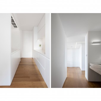
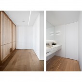
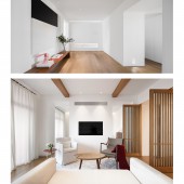
| DESIGN NAME: Hello Seven Construct PRIMARY FUNCTION: Office INSPIRATION: Simplicity is always favored from the very beginning. It seems like too plain and dull to be of much white, however, it expresses a kind of succinctness, elegance, peace and simplicity. Solute to Minimalism. Seven Space was born with designer’s passionate love and persistence. Copying other’s design and stealing other’s idea are so common and some of the so-called designs are complicated and unpractical that the local people don’t think high of the design, neither do they understand its value. We are trying hard to change such a sorrowful situation, even if what we do is of little influence. That’s what drives us to start a design office which focuses on user’s experience and making office a better place just like our home, rather than somewhere simply like you can find in other office. We deny a design that only steals the spotlight, because we sincerely care for you with love. We desire to create a room making people pleasant and peaceful, and we are eager to have our attitude to design and life entirely known by our user. Our original intention is to invite more people to understand the importance of design in our life. UNIQUE PROPERTIES / PROJECT DESCRIPTION: Restore the essence of the architecture through design. With respect to the structure of the architecture, nature and light, we believe using white widely in this room presents a sort of essence. That’s a uniqueness of this room, which expresses the idea of less is more. We didn’t design the hallway as a traditional reception room, but as a space showing some unique concept. With high contrast artistic decorative painting and high-colored oil painting on the plain white wall, people who walk into the room could sense its specialty. The sculpture works of rabbit women “I saw my happiness” as well as horse head “Could this world get well?” are not simply dead decorations, they are a kind of symbol that represents the spiritual and emotional change of the time. It is so nice to meet a beautifully designed space with sort of inner meaning. Though the office is not large, each room is not without its own style. We are able to create significance, cleanness, peace and durability by making the best of white in a large place. We focus more on artistic conception rather than simply making a formal break. I love minimalism for its pureness. OPERATION / FLOW / INTERACTION: The space sensibility is enormous while the design is invisible, and anyone in this room could be its master. The office is available for both myself and my colleagues. After moving into this office, we paid more attention to keep the office clean and tidy. We agree that an elegant environment could possibly change the inhabitant’s habit and personality. We take a good care of the environment and it will pay back vice versa. That happens to be the same view with my original idea. The purer a space looks like, the more cares are required to keep it right. As aesthetic life style is actually very subtle, we have to discover it by our keenness and create and keep it with our own hands. I am so proud and satisfied to see all these changes to our life. PROJECT DURATION AND LOCATION: Located at 901-2-3 Wanshen Residence Area, Rui’an, Wenzhou, Zhejiang province, the project started on 11.08 2016 and finished in March 2017. FITS BEST INTO CATEGORY: Interior Space and Exhibition Design |
PRODUCTION / REALIZATION TECHNOLOGY: The idea of less is more could be found from the left open office space to tea room as well as operation floor, so do the VIP living room and even the most covert director room. Every detail is carefully designed to meet the functional demand. The embedded skirting line under the white wall is such an exquisite detail. As for the TV wall in the living room, we decided to use material as thin as possible. In consideration of the cost of the thinnest iron plate or steel plate would be much more expensive, we choose the cheapest plasterboard which functions as well as others. The TV is put behind the ultra-thin partition, making it look like brimless. The handle of the cabinet is sort of hidden one-piece handle instead of metal. There is no abrupt water-line on the surface of the cabinet, which looks much nicer. It costed us lots of time and endeavor to finish the hidden doors of the washroom and storeroom. We have tried many different ways until we finally finished them flawlessly. It requires very high crafts-work to make a perfect hidden door which looks like so simple. These details won’t have been perfectly done if not with ingenuity and abundant working experience. There is a hidden pull-push tissue box at the lower left quarter of the wash basin. The wall body between dry area and inner washroom is made as thick as 12 cm, so that a hidden pull-push tissue box could be prepared. This is such a small detail that would see how the designer cares for the user’s basic needs. SPECIFICATIONS / TECHNICAL PROPERTIES: The office is designed for a capacity of 6 to 8 workers. Occupying 130 square meters in total, the office consists of a 16 square meters hallway, a 22 square meters open office space, a 10 square meters tea room and operation floor, two 5 square meters washrooms(including the dry area washroom), a 4 square meters storeroom(including the cabinet), a 25.5 square meters living room, a 15.5 square meters director room and a 6 square meters aisle. The building wall shares the rest. There is a balcony designed as a relaxation corner with green plants. A revolving door, which consists of 3 doors with a length of 2.7 meters, cuts off the living room and aisle. The 1.1 meters middle one could turn 360 degrees. TAGS: Seven Space, Minimalism, White, Experience RESEARCH ABSTRACT: Our research is a kind of pure design. We only design for quality rather than quantity. We aim to maximum the value of design. Our team consists of two designer assistants and two draftsmen, and a soft outfit assistant as well as two major design and a customer service. Invisible design advocates a kind of design that requests people to sense the design by heart rather than by eyes. I particularly emphasize the user’s functional and sensory experience. Besides, humanity, comfort, security and entertainment are always my favored design attitude. Be it a minimalism or oriental or western design, only those designs made by heart could be accepted by the time. Almost every owner entered this room expressed their surprise that how could a clear white room like this be so elegant, meaningful and beautiful. Although the major material used in this project are floor, wooden door and latex paint and little dimension stone, the floor brand just got very popular afterward. The designing cost is usually very low in this small city, however, the owners would be very gladly to pay for the designing fee after they visited this office. Our project is so popular that it got a 10,000+ online click in the first two hours and got forward widely by others. CHALLENGE: The limited space of this project is my most regretful point, as my initial intention was to design in a capacious villa with a yard. Failed to find a proper location, we had to choose this residential area as our office. Given the set structure, we tried hard to make it a flattop to avoid huge damage to the beams. We set a door to hide the beam. We can’t make the whole office a flattop as the central air-conditioning occupies some space. We managed to set the central air-conditioning inside the wall, with wind breezing from the wall and the air return circulating behind the wall. The printing operation floor is right under the air return mouth. ADDED DATE: 2017-09-29 15:40:57 TEAM MEMBERS (2) : Sunshine Wong 黄小影 and Jason Wong 黄齐正 IMAGE CREDITS: Image #1: WU CHANG LE,Operating room and corridor, September 10, 2017 Image #2: WU CHANG LE,Public office area and director , September 10, 2017 Image #3: WU CHANG LE,Storage room and hand washing area, September 10, 2017 Image #4: WU CHANG LE,Vestibule side and reception area side, September 10, 2017 Image #5: WU CHANG LE,Entrance and reception area, September 10, 2017 PATENTS/COPYRIGHTS: Copyrights belong to CHINA SEVEN CONSTRUCT SPACE DESIGN CO.,LTD. |
||||
| Visit the following page to learn more: https://mp.weixin.qq.com/mp/homepage?__b |
|||||
| AWARD DETAILS | |
 |
Hello Seven Construct Office by Sunshine Wong and Jason Wong is Winner in Interior Space and Exhibition Design Category, 2017 - 2018.· Read the interview with designer Sunshine Wong and Jason Wong for design Hello Seven Construct here.· Press Members: Login or Register to request an exclusive interview with Sunshine Wong and Jason Wong . · Click here to register inorder to view the profile and other works by Sunshine Wong and Jason Wong . |
| SOCIAL |
| + Add to Likes / Favorites | Send to My Email | Comment | Testimonials | View Press-Release | Press Kit |
Did you like Sunshine Wong and Jason Wong's Interior Design?
You will most likely enjoy other award winning interior design as well.
Click here to view more Award Winning Interior Design.


