Brand Thinkers Branding by Felipe Jacoto |
Home > Winners > #61432 |
 |
|
||||
| DESIGN DETAILS | |||||
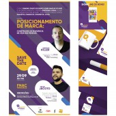
| DESIGN NAME: Brand Thinkers PRIMARY FUNCTION: Branding INSPIRATION: The project sought to inspire and convey two concepts: Talking and Thinking about brands. The lower-case letter "b", even in its abstracted form on the brand icon, represents the balloon of speech merging with the clouds of thinking, forming a brand in which the concept of dialogue and new ideas about the universe of brands are united. In addition to these two main aspects of thought and speech, the brand sought to express a simple, interactive image that provided reflection. UNIQUE PROPERTIES / PROJECT DESCRIPTION: Brand Thinkers is the most genuine discussion group on Branding in Brazil that meets monthly in the city of São Paulo for talks about brand design, best practices and trends of brands and always with a name of reference in the subject, idealized by the master Marcos Hiller. OPERATION / FLOW / INTERACTION: The good functioning of this Visual Identity is due to its simplicity and easy applications and to its symbol that has a different and young form. This influences and works well in your main application of your website and social networks, where the dispute for attention is very strong. With this symbol, social media has become stronger and visually stunning. PROJECT DURATION AND LOCATION: The project started in July 2017 and ended in September 2017. It was developed in the city and state of São Paulo, Brazil. The project was presented and shared by several people and media, reaching 46,984 views on the Adobe Behance platform, and certified by Behance's curatorship in Graphic Design. FITS BEST INTO CATEGORY: Graphics, Illustration and Visual Communication Design |
PRODUCTION / REALIZATION TECHNOLOGY: Sketches, brainstorms, and mind maps were central to the conceptual phase and to the generation of ideas. After choosing the concept of form, the project went through Adobe Illustrator, Adobe Photoshop and the application of the Golden Ratio in its final form. His Visual Identity was created with strong proportional, symbolic and flexible work. SPECIFICATIONS / TECHNICAL PROPERTIES: The project does not have a specific size or measure because it is a brand. But, for sizing purposes, we can understand that their proportional ratios maintain in Phi, which is approximately 1,618, the Gold Ratio. TAGS: brand, thinkers, design, logo, phi, grid, fibonacci, identity visual, logotype, type design, icon, golden ratio RESEARCH ABSTRACT: It was necessary to convey the idea of speaking and thinking about brand and despite the simplicity of the word, are very common concept and very difficult to be represented in an innovative and creative way, being very common figurative elements. The insight of mixing the speech bubble with the clouds of thought, provided the representation of the brand and the concept with a creative, inspiring and minimalist language. CHALLENGE: The big challenge in developing the brand was to create a visual identity to represent a group that discusses brands that is made up of several Branding specialists. Fortunately, the results were excellent and we achieved the goal of a remarkable Visual Identity, with the ability to generate discussions and thus strengthen the Brand Thinkers group. ADDED DATE: 2017-09-28 20:52:37 TEAM MEMBERS (1) : IMAGE CREDITS: Felipe Jacoto, 2017. |
||||
| Visit the following page to learn more: https://www.behance.net/felipejacoto | |||||
| AWARD DETAILS | |
 |
Brand Thinkers Branding by Felipe Jacoto is Winner in Graphics, Illustration and Visual Communication Design Category, 2017 - 2018.· Press Members: Login or Register to request an exclusive interview with Felipe Jacoto. · Click here to register inorder to view the profile and other works by Felipe Jacoto. |
| SOCIAL |
| + Add to Likes / Favorites | Send to My Email | Comment | Testimonials | View Press-Release | Press Kit |


