DESIGN NAME:
BB Signature
PRIMARY FUNCTION:
Wine bottles
INSPIRATION:
Bernard Lonclas is a best selling champagne produced by Vines & Terriors. In revamping and modernising the brand, INDICUBE was commissioned to redesign the identity and wine bottle based on its new name - BB Signature, derived and translated from "BB Initiales", a 1968 French song by the scandalous Serge Gainsbourg. The lyrics depict a mysterious woman at an English pub, "She wears nothing aside from a little essence of Guerlain in her hair". The champagne too, should evoke the same sense of mystery and provocative allure.
UNIQUE PROPERTIES / PROJECT DESCRIPTION:
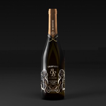
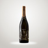
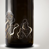
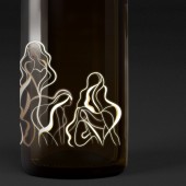
The design translates the imagery of the woman using curvy lines and sensual silhouettes. By adding suave and curves to the lines, a smoke-line effect is created, resembling the effervescence of champagne. The figures form a lace-like pattern, where a balance between the literal and figurative is achieved.
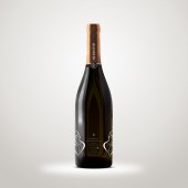
White and gold are the dominant colour pairings, with white to correspond with the blanc de blancs quality of the champagne, and gold to manifest luxurity and class. Red for the lips accents the seductiveness of the figures.
OPERATION / FLOW / INTERACTION:
Glow-in-the-dark serigraph is used for the printing of the graphics, this creates a mesmerizing effect when displaying the bottle at night or in darker environments and adds to the mysteriousness and enchantment. While the gold foil provides reflection and bounces off light in the day, which is similarly eye catching.
PROJECT DURATION AND LOCATION:
The design started in February 2017 and completed in September 2017, Hong Kong.
FITS BEST INTO CATEGORY:
Packaging Design
|
PRODUCTION / REALIZATION TECHNOLOGY:
Gold hot stamping and tri-colour serigraph with glow-in-the-dark effect
SPECIFICATIONS / TECHNICAL PROPERTIES:
Bottle circumference: 289mm
Bottle height: 320mm
TAGS:
champagne, bottle, identity, design, luxury, packaging
RESEARCH ABSTRACT:
We decided that the design concept had to stem from the song BB Intiales. In starting the project, the lyrics were carefully examined so that important visuals were extracted to illustrate and experiment with.
In depth creative research was conducted to explore the best illustration style to suit the brand objective. We looked at the use of negative space by illustrator Malika Favre, female drawings and graphics of the 60s and 70s, Parisian illustrations etc.
Research in technological requirements of serigraphy was also carried out to make the best out of this printing technique.
CHALLENGE:
Although the brand was inspired by a scandalous song, it was important to make sure that the graphics can attain a good balance between erotic and class, so that imageries are not overly sexual or explicit.
There were also limitations to printing on glass bottles, as client could only provide filled wine bottles, thus 3-dimensional printing effects which incurs hurning of the bottles cannot be used. We had to devise the best way to create a striking design given the limitations.
ADDED DATE:
2017-09-28 07:41:54
TEAM MEMBERS (2) :
Creative director: Ruth Chao and Designer: Magdalene Lam
IMAGE CREDITS:
Ruth Chao, 2017.
PATENTS/COPYRIGHTS:
Copyright belong to INDICUBE Ltd., 2017
|


