DESIGN NAME:
INTERFACE
PRIMARY FUNCTION:
Exhibition Place
INSPIRATION:
Themed by art display and human interaction through the open and penetrating design techniques, the office, exhibition area and street scene are integrated. The layers overlapped by different dimensions and heights connect the interaction and rhythm of the cities, people and life which allows art to walk into life and integrate into city and the public.
UNIQUE PROPERTIES / PROJECT DESCRIPTION:
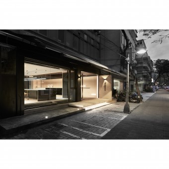
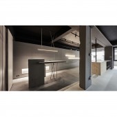
The case is located in a dense old condominium complex. From the perspective of design, the space is divided into two blocks: exhibition space and office space. By expanding the area of the window view, the space is greatly increased and the distance is further reduced. The folding plate from different dimension defines the space of different attribute with an extension outward which link the city and life and create art / office compound space interacting with city and the public.
OPERATION / FLOW / INTERACTION:
-
PROJECT DURATION AND LOCATION:
The project started in Oct. 2016 and finished in Jan. 2017 in Taipei, Taiwan
FITS BEST INTO CATEGORY:
Interior Space and Exhibition Design
|
PRODUCTION / REALIZATION TECHNOLOGY:
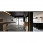
To solve the problem of lighting and the closure of the housing condition, the external walls were replaced by the massive glass medium to introduce more lighting and street view. We retreated the entrance and the display space was taken up by a cement flap, and extended outward to allow indoor activities to engage with outsiders; while the white cement flap leave off the original floor in a semi-coated and suspended way to implicitly divide the independent areas that are supplemented by facade display wall, bar and other configurations to give flexibility in work type.
SPECIFICATIONS / TECHNICAL PROPERTIES:
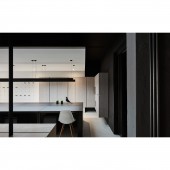
Through the window view, the entire walking and running urban street scene becomes the background. The extended outward platform has become a gathering point in the corner of the city where people can stay and stop which promote unexpected interactions. The color tones tend to black, gray, white and other gray-scale color to reduce the saturation of space supplemented by light, the intervention of neat linear, overlap, stretch, and try to retain the original state of the material. The understated and minimalist atmosphere represents the rich colors and diversity of the paintings.
TAGS:
Interior, Design, House, Residence, Simple, Light, Natural
RESEARCH ABSTRACT:
We opened up a substantial window view to enable the convergence of the original entry position. The display space is connected by the cement flap which also connects the outdoor and the indoor. The external floating platform has become a corner of the city gathering point; while the white folding flap toward another direction leaves the original floor in semi-coated and suspended way to implicitly divide the area, and is supplemented by facade display wall, bar and other configurations. This gives flexibility in work patterns as well as reduces the use of color which makes the art display become the most wonderful protagonist.
CHALLENGE:
It is the change of the heavy impression of cement quantity in an attempt to use the most concise, lightweight design techniques to blur the boundaries of work / art / city pattern, and to satisfy the functionality of space in work and display areas.
ADDED DATE:
2017-09-25 10:27:35
TEAM MEMBERS (1) :
IMAGE CREDITS:
Hey! Cheese Photography Studio
|


