DESIGN NAME:
Trimensional Space
PRIMARY FUNCTION:
Cinema
INSPIRATION:
Worlds that movies created can be sometimes beyond reality. A kind of beauty that challenges boundaries, mystical objects or creatures that is beyond imagination. Judging by that, is there a mission, a purpose, which the existence of cinema serves? Other than providing a place for entertainment, a good cinema can act as a bridge that connects the fictional world and the real world.
UNIQUE PROPERTIES / PROJECT DESCRIPTION:
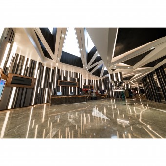
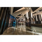
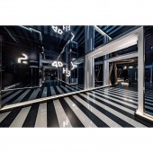
In Japanese animation and comic culture, ‘three-dimensional’ refers to the real world, while ‘two-dimensional�� refers to the animated world, which solely happens within the fictional world. The design concept Trimensional Space thus arises: creating a space where the line dividing three-dimensional and two-dimensional are blurred. A lot of irregular pyramids and flat rectangular prisms were used to decorate the interior; with an aid of light and shadow, the interior space was visually distorted, causing an intriguing illusion to its audience. By lengthening or shortening the visual space, it added in more possibilities for the cinema space, providing more inspiration to the audience.
The distortion of space started off at the outdoor façade area. It mainly consists of white and light grey colour, joining in harmony with full-length curtain wall with grey glass and matt surface, which contributed to help the space look larger than the actual size. This expanded the visual space that offers better scenery from the inside out, because on the other side of the windows, it is the lobby and book café area. At the lobby and book café, we continued to play with visual impact by placing irregular triangular frames in the ceiling, painted with white glossy paint. These shapes surrounded different materials including long striped wood laminate and black mirror stainless steel. While on the walls, LED lighting strips, black wooden strips and grey triangular aluminum strips were laid out across in a random order, so that the lighting strips blended in better. The same thing goes to the ticket counter, where we wanted the counter to blend in more instead of outstood at the floor, which is why the counter has a black marble finishing and the floor has white marble finishing, making the counter look as if it was grown from the floor naturally. Natural combination of materials was as well important in the book café area, as it is the ideal place for audience to rest. The full-length glass windows allowing sunlight to shine through helped to enhance that.
OPERATION / FLOW / INTERACTION:
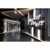
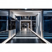
After getting started at the grand entrance, take a turn to the corridor where colour combination is much darker. Black wooden strips, black mirrored surfaces and grey aluminum strips contrasted the lighting and illuminated signage. Other than a row of round spotlight in the ceiling, almost all lighting at the corridor are in strips. These neat and long lighting along with hairline stainless steel strips sweep from the top to the sidewalls, with the same pattern stretching towards the floor. When an audience walks in the corridor, he or she will feel like travelling through time: the corridor seems to expand and lengthen visually. The wooden strips crossed each other from the ceiling to the walls, which further gave interference to the sight that the space was expanding indefinitely.
When it is screening time, come to either one of the houses: Typical House and VIP House. The two types of house both rely on the basis of a triangular shape, but the outcomes were seemingly different. Equilateral triangles were used in the Typical House, where different sizes, colours and materials of triangular shapes were used as decorations. The triangles shared sides, with occasional wall light hanged on among them. Both the walls and the seats consist of grey and blue colour; but they are not just any other cold colours because of the balance brought by warm concealed light trough on the sides. Whereas the VIP House, a tangram was the source of inspiration. Wall lights are also hidden on the side of the shapes. Core colours of this type of house are grey, dark and light purple; with a few warm spotlights in the ceiling, it made the warm colours even more lively and shifted focus on the wide, cozy, dark grey leather seating.
PROJECT DURATION AND LOCATION:
The project started in May 2016 in Xian, China and finished in September 2017.
FITS BEST INTO CATEGORY:
Interior Space and Exhibition Design
|
PRODUCTION / REALIZATION TECHNOLOGY:
-
SPECIFICATIONS / TECHNICAL PROPERTIES:
-
TAGS:
cinema, entertainment, public, leisure
RESEARCH ABSTRACT:
-
CHALLENGE:
We did not want to confuse the audience too much on playing with visual illusion, therefore the lavatory is significantly brighter, suitable for one to refresh the mind after diving into the world in movies. Here in the lavatory, there are beige tile floor finishing, white tile wall finishing, white marble skirting and basin, wood finishing with pattern. Light colour tone with bright lighting helped to wake audience up, pulling them back to reality. In a cinema where the fictional world and the real world are fused, it is best to have a place where the audience can prepare themselves again between screening time.
ADDED DATE:
2017-09-25 10:00:04
TEAM MEMBERS (5) :
CM Jao, Ken Cheung, Kalium Chan, Tobey Ngo and Yoyo Au
IMAGE CREDITS:
NKCHU
PATENTS/COPYRIGHTS:
Copyrights belong to Oft Interiors Ltd., 2017
|
