Geo-electrified Cinema by CM Jao and Ken Cheung |
Home > Winners > #61065 |
 |
|
||||
| DESIGN DETAILS | |||||
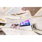
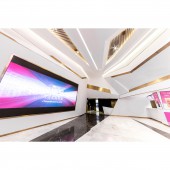
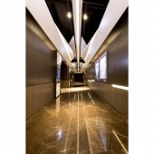
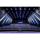
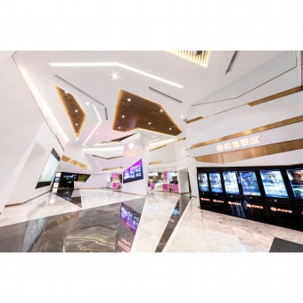
| DESIGN NAME: Geo-electrified PRIMARY FUNCTION: Cinema INSPIRATION: There may not be a universal definition for aesthetics; but often times, there are certain rules in beauty. In films, for example, certain rules are often followed in order to produce magnificent outcomes. The rules include shooting angle, composition, colour and contrast etc., together, these made up the bible of stunning films. It is all about plots. From the visual plot on screen to the aesthetic plot in interior design, we thought of a significant concept to design this cinema: Geometry. Starting from the houses as an introduction of Geometry, we first established some rules and laws in the spaces we had. Since ‘points, lines and planes’ are the fundamental elements in Geometry, we used these to design the two types of houses: Standard House and IMAX House. The interiors of the two both have neat lines and shapes, made up by dots, from one point to another. Colours are highly contrasted, with sharp lines drawn in between to distinguish them. In the Standard House, titanium black and dark red are used, with mirrored lines and shapes on both sides of the wall. The ceiling is made up of squared tiles, in which the subtle appearance helped the shapes on walls to stand out. While in the IMAX House, cold blue and warm light brown colours are used. Extended rectangular shapes on both sides of the walls soared up to the ceiling, representing the visual and audio impact this IMAX experience is offering to its audience. UNIQUE PROPERTIES / PROJECT DESCRIPTION: After establishing the fundamental rules of Geometry, we started to apply the concept to create geometric shapes. There are two main materials used in the lavatories: wood grain plastic laminated and black mirror. The two are highly contrasted in terms of colour and texture. By utilizing the contrast between them, we were able to draw lines and shapes we desired to display. Lights are hidden carefully and subtly in the ceiling, trying to shine in an exquisite way like a supporting actor. Because after all, the geometric shapes on the floor and walls are under the spotlight. OPERATION / FLOW / INTERACTION: Geometry and mathematics are often in joined hands, since shapes and figures can be numerically calculated, so that the space can be symmetrized. The corridor is the best area to interpret a symmetrical space. So we painted it in bronze colour, decorated with metal mesh panels and wood grain plastic laminated, imposing a significantly symmetrical order. We imagined a double-sided mirror was placed right in the middle, reflecting the same imagery in opposite direction: mimicking the ‘symmetrical framing’ commonly used in films. Lights in the ceiling and walls are used to edge out geometric shapes. To enhance these shapes, the ceiling surmounted the usual 2-dimensional and popped out to form symmetrical 3-dimensional shapes, combined by white aluminum panels and black metal mesh panels. Such balanced aesthetic was carefully calculated, perfect for a long corridor like this. PROJECT DURATION AND LOCATION: The project started in January 2017 in ZhangMutou, China and finished in August 2017. FITS BEST INTO CATEGORY: Interior Space and Exhibition Design |
PRODUCTION / REALIZATION TECHNOLOGY: Rules can be applied, assuring stunning results. But what is more important is to create our own rules! Under certain fundamental circumstances, we hoped to think out of the box and imagine beyond limitations. The beauty of Geometry is as unlimited as our imagination. Imagination fully emerged at the lobby, as irregular shapes are used for the walls, columns, ceiling, and ticketing counter. White and bronze colours travelled through the whole lobby to form sharp lines. Under the right amount of lights, different surfaces of the 3-dimensional shapes are in different shades of white, enhanced by its shadows on the sides. The edge of the digital screen is merged into lines on walls, in sync with the irregular shapes, introducing this new set of rules. SPECIFICATIONS / TECHNICAL PROPERTIES: - TAGS: cinema, entertainment, public, leisure, RESEARCH ABSTRACT: - CHALLENGE: There is no definite annotation in Geometry, and it can often be applied to many fields, including mathematics, physics, art, as well as architecture. Instead of following the rules, we decided to create our own rules. It is because that is the only way to create the most unique, comfortable and practical space. ADDED DATE: 2017-09-25 09:57:58 TEAM MEMBERS (3) : CM Jao, Ken Cheung and Frankie Chao IMAGE CREDITS: NKCHU PATENTS/COPYRIGHTS: Copyrights belong to Oft Interiors Ltd., 2017 |
||||
| Visit the following page to learn more: http://www.oftinteriors.com | |||||
| AWARD DETAILS | |
 |
Geo-Electrified Cinema by Cm Jao and Ken Cheung is Winner in Interior Space and Exhibition Design Category, 2017 - 2018.· Press Members: Login or Register to request an exclusive interview with CM Jao and Ken Cheung. · Click here to register inorder to view the profile and other works by CM Jao and Ken Cheung. |
| SOCIAL |
| + Add to Likes / Favorites | Send to My Email | Comment | Testimonials | View Press-Release | Press Kit |

