The Script Cinema by CM Jao and Ken Cheung |
Home > Winners > #61063 |
 |
|
||||
| DESIGN DETAILS | |||||
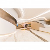
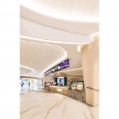
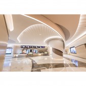
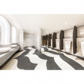
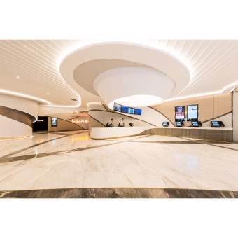
| DESIGN NAME: The Script PRIMARY FUNCTION: Cinema INSPIRATION: When we trace back the origin of a film – or the soul of it – it always comes to ‘the script’. A pile of paper can work magic on films. And the same thing goes to interior design too. At the initial stage of designing, sketches and drafts happen on papers also. Leveraging this to our design concept of this cinema, the team wanted to draft a script and cast it into the interior space we had. We imagined a book of script being thrown into the air, papers forming mesmerizing curves that open a pathway for the audience to wander into a world of films. UNIQUE PROPERTIES / PROJECT DESCRIPTION: In order to portray this state of mind, it is important that we choose the right shapes and lighting. We used a lot of curves, arcs, and beige colour lights throughout the whole cinema, just to create vibes similar to papers being thrown into the air. We also divided the cinema into four parts: (i) opening, (ii) developing, (iii) changing and (iv) concluding – the four steps of Chinese regulated classic writing. These four parts follow in order of an average audience’s journey. The first part is ‘opening’, symbolized by the entrance of the cinema including ticket counter and food stalls. Here we used sleek lines and edges to welcome every audience, drawing their attention in the most natural way, as in films where the opening scene fades in from all black. There are also the same curves in the ceiling, so that it can join in with lines on walls under soft beige lights. In between walls there are some subtle wood pattern facing behind a layer of white curvy walls. With aid of white lights along the curves, the walls look like an opened book, revealing intriguing forewords. After the glorious opening, our design story continues to the next part: ‘developing’. Along the hallway, both walls and the ceiling are extending the curvy lines and shapes of the previous part, whilst the patterns on the floor find their ways to go through, indicating clear directions to different houses on the hallway. Since it is important for this ‘developing’ part to enhance what was started in the ‘opening’, we used a slightly darker colour on the walls to increase tension. This is to prepare audience to feel more involved in the cinematic experience, right before going into each house for screening. Followed by that, it is time for a little plot twist: ‘changing’. In the middle of the hallway with a turn, you will find the male and female washrooms. This symbolizes ‘changing’ in a script, which explains why the look and feel of this part are quite different than the previous. Upon stepping into the washrooms, you will find a much brighter white light. This helps in intensifying the black and white colour contrast used in general. Full-body mirrors are used and placed to reflect each other, creating an infinite space for the audience to explore in this sea of imagination – just like any plot twist in a script. OPERATION / FLOW / INTERACTION: Journey through the script ends with the part ‘concluding’, which is represented by the houses. The sleek curves are not paused or stopped in this part. Different colour tiles with curvy edges are the skin of professional audio equipment, giving the best sounds to surround in the house. As a finale to the journey, colours used here are much more vibrant yet holding onto the subtle style, mix and match with unique colour choices. Walls are with warm colours; chairs with cold colours. This mixture works for both dimmed and bright lights. In dimmed lights, it allows audience to dive in to the films they are watching; in bright lights, it allows audience to gently pull themselves back to reality. PROJECT DURATION AND LOCATION: The project started in May 2016 in Shenzhen, China and finished in May 2017. FITS BEST INTO CATEGORY: Interior Space and Exhibition Design |
PRODUCTION / REALIZATION TECHNOLOGY: - SPECIFICATIONS / TECHNICAL PROPERTIES: - TAGS: - RESEARCH ABSTRACT: - CHALLENGE: How do we make a still space as engaging as a film? This was a question we asked ourselves when we first started this project. Films, in another words, are moving pictures, a sequence of still photos. Hence, we designed by breaking down the cinema into pieces, as if we would freeze the screen at our favourite moment of a film. Collaborated the captivating element of films; we successfully turned this cinema into a series of moving pictures, letting audience embrace the holistic cinematic experience. ADDED DATE: 2017-09-25 09:54:57 TEAM MEMBERS (3) : CM Jao, Ken Cheung and Shanny Cheung IMAGE CREDITS: NKCHU PATENTS/COPYRIGHTS: Copyrights belong to Oft Interiors Ltd., 2017 |
||||
| Visit the following page to learn more: http://www.oftinteriors.com | |||||
| AWARD DETAILS | |
 |
The Script Cinema by Cm Jao and Ken Cheung is Winner in Interior Space and Exhibition Design Category, 2017 - 2018.· Press Members: Login or Register to request an exclusive interview with CM Jao and Ken Cheung. · Click here to register inorder to view the profile and other works by CM Jao and Ken Cheung. |
| SOCIAL |
| + Add to Likes / Favorites | Send to My Email | Comment | Testimonials | View Press-Release | Press Kit |

