A Little Something for You Company Christmas Card by Benny Leung and Kit Ng - BLCH Ltd. |
Home > Winners > #60869 |
 |
|
||||
| DESIGN DETAILS | |||||
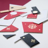
| DESIGN NAME: A Little Something for You PRIMARY FUNCTION: Company Christmas Card INSPIRATION: We always want to use our Christmas cards to try different print style. Using this opportunity to test and provide our audience with something more unique and playful. Our inspiration was to see if we can try to take a normal card and make it so there is more elements/ detail in it so that the receiver can play with it longer. UNIQUE PROPERTIES / PROJECT DESCRIPTION: A Christmas card that allows the receiver to have some fun with giving them 3 different greetings. The first greeting is an abstract greeting design. Secondly you can re-arrangle the puzzle to form a side view of a santa claus. Third if you flip the card over, you can assemble a Christmas word greeting. OPERATION / FLOW / INTERACTION: There are 3 parts to this Christmas card. First part is when you open the card, you will have a abstract / minimalistic christmas card design. Second part is if you take the pieces apart, and align them properly, you will see the side view of a santa claus. The last part is if you turn it around and put the pieces together properly, a christmas message reveals. PROJECT DURATION AND LOCATION: The project started in late Nov 2015 and finished in Dec 2015 just in time to be mailed to ppl before Christmas. |
PRODUCTION / REALIZATION TECHNOLOGY: We started with the idea of a puzzle. A simple puzzle that the receiver can have a little fun with. Then it evolve into why don't we try to use different shapes and see if we can make it so that there are multiple interpretation of christmas. Material wise, we kept it quite simple picking out durable paper source that works well with block colors and gold foil. SPECIFICATIONS / TECHNICAL PROPERTIES: approx 14cm D x 24cm W TAGS: christmas, minimalistic, puzzle, greetingcard, interactive RESEARCH ABSTRACT: The main research we did after we had the idea is to look at different santa claus picture and dissect how we can make a version of him, keep it simple, yet still recognisable to others. The simple shapes we can use, the placement of colors were areas we spent a lot of time in. After we have that, we study different minimalistic design online to come up with our own abstract design to break apart the santa claus look. CHALLENGE: The hardest part was getting the diecut in the print house. We didn't have much time before we need to finish and sent out so the hard angles of the shape was hard for the printer to do. ADDED DATE: 2017-09-22 03:38:36 TEAM MEMBERS (2) : Benny Leung and Kit Ng IMAGE CREDITS: Image #1: Photographer Kit Ng, Little Something, 2015 Image #2: Photographer Kit Ng, Little Something, 2015 Image #3: Photographer Kit Ng, Little Something, 2015 Image #4: Photographer Kit Ng, Little Something, 2015 Image #5: Photographer Kit Ng, Little Something, 2015 |
||||
| Visit the following page to learn more: http://www.blch.co | |||||
| AWARD DETAILS | |
 |
A Little Something For You Company Christmas Card by Benny Leung and Kit Ng-Blch Ltd is Winner in Graphics, Illustration and Visual Communication Design Category, 2017 - 2018.· Press Members: Login or Register to request an exclusive interview with Benny Leung and Kit Ng - BLCH Ltd.. · Click here to register inorder to view the profile and other works by Benny Leung and Kit Ng - BLCH Ltd.. |
| SOCIAL |
| + Add to Likes / Favorites | Send to My Email | Comment | Testimonials | View Press-Release | Press Kit |


