Met Bookshop VI Design by Lu Zhao & Genle Zhu |
Home > Winners > #60409 |
 |
|
||||
| DESIGN DETAILS | |||||
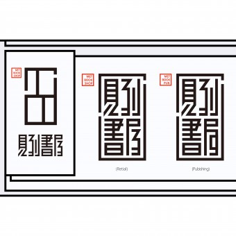
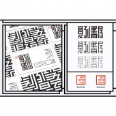
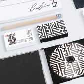
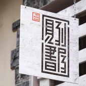
| DESIGN NAME: Met Bookshop PRIMARY FUNCTION: VI Design INSPIRATION: This work was inspired by the layout of Chinese traditional book. Specifically, the modality of the logo originates from the ancient book’s binding and layout, it used to contain the red printed and calligraphic title frame. Through a series refining, a certain appearance which maintains contemporary style are presented. UNIQUE PROPERTIES / PROJECT DESCRIPTION: These serial logos consist of two parts, the graphic logo and the character logo, hereinto, the text logo include Met bookshop’s publishing branch and Met bookshop’s retail branch. The main body of the character logo is transformed by Chinese character – "Jian Dao Shu Wu", which imitates modality of layout and seal of Chinese ancient book cover. After simplification and abstraction, the logo retains the oriental but contemporary melody. In addition, the graphic logo is simply transferred from the text logo, it integrates the form of three capital words-MBS (the abbreviation of met bookshop). At the main time, the shape of the logo can be seen as a bookshelf with four books on, people can more directly identify the function of the logo from its shape. OPERATION / FLOW / INTERACTION: - PROJECT DURATION AND LOCATION: - FITS BEST INTO CATEGORY: Graphics, Illustration and Visual Communication Design |
PRODUCTION / REALIZATION TECHNOLOGY: - SPECIFICATIONS / TECHNICAL PROPERTIES: - TAGS: VI , bookshop , logo , Chinese , RESEARCH ABSTRACT: - CHALLENGE: - ADDED DATE: 2017-09-15 09:45:43 TEAM MEMBERS (2) : Creative Director:Lu Zhao and Designer: Genle Zhu IMAGE CREDITS: Image #1 : Genle Zhu, Met Bookshop logo, 2017. Image #1 : Genle Zhu, logo introduction and pattern, 2017. Image #1 : Genle Zhu, logo typography, 2017. Image #1 : Genle Zhu, logo display and application, 2017. Image #1 : Genle Zhu, logo display and application, 2017. |
||||
| Visit the following page to learn more: http://Genle.cc | |||||
| AWARD DETAILS | |
 |
Met Bookshop Vi Design by Lu Zhao & Genle Zhu is Winner in Graphics, Illustration and Visual Communication Design Category, 2017 - 2018.· Press Members: Login or Register to request an exclusive interview with Lu Zhao & Genle Zhu. · Click here to register inorder to view the profile and other works by Lu Zhao & Genle Zhu. |
| SOCIAL |
| + Add to Likes / Favorites | Send to My Email | Comment | Testimonials | View Press-Release | Press Kit |


