Alphabet Experimental Exploration, Design, Logo, Letterforms by Julien Perraudin |
Home > Winners > #60237 |
 |
|
||||
| DESIGN DETAILS | |||||
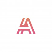
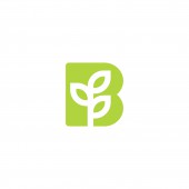
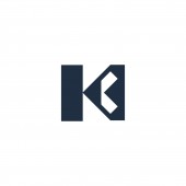
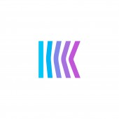
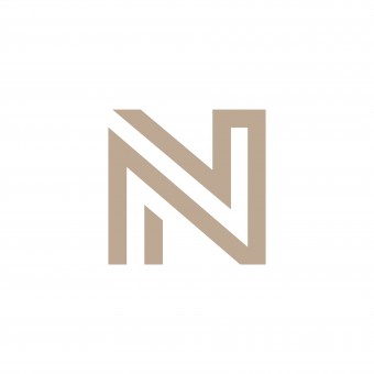
| DESIGN NAME: Alphabet Experimental PRIMARY FUNCTION: Exploration, Design, Logo, Letterforms INSPIRATION: The main goal of this particular work was to explore the alphabet through various graphic treatments: colors, grayscale, simple lines, but also more complex approaches. I worked on every letter in a minimalist way, like I would do for a brand or a logotype. Some letters are very "corporate" UNIQUE PROPERTIES / PROJECT DESCRIPTION: The main goal of this particular work was to explore the alphabet through various graphic treatments: colors, grayscale, simple lines, but also more complex approaches. I worked on every letter in a minimalist way, like I would do for a brand or a logotype. Some letters are very "corporate" OPERATION / FLOW / INTERACTION: The product is intended for large-scale printing and for exhibition purpose PROJECT DURATION AND LOCATION: the concept to start in mid-2017 and will improve thereafter. an exhibition will take place in the course of next year FITS BEST INTO CATEGORY: Graphics, Illustration and Visual Communication Design |
PRODUCTION / REALIZATION TECHNOLOGY: The project is realized vith illustrator. The project letter is in vector SPECIFICATIONS / TECHNICAL PROPERTIES: he dimensions range from support A5 to A1 TAGS: ogotype, letterforms, monogram, letter, minimal, brand RESEARCH ABSTRACT: Passionate about branding, I find my inspiration in every brand logo, from the famous ones to the lesser-known. With this work, my goal was to create a full alphabet with every letter treated as a logotype. My inspirations come from everywhere - from the work of agencies like Monogram to any other famous corporates or brands. CHALLENGE: he hardest part was sorting the letters to make an assemblage and an understandable presentation ADDED DATE: 2017-09-11 18:38:16 TEAM MEMBERS (1) : monome - Julien Perraudin IMAGE CREDITS: creator monome Julien Perraudin |
||||
| Visit the following page to learn more: https://www.behance.net/gallery/56623543 |
|||||
| AWARD DETAILS | |
 |
Alphabet Experimental Exploration, Design, Logo, Letterforms by Julien Perraudin is Winner in Graphics, Illustration and Visual Communication Design Category, 2017 - 2018.· Press Members: Login or Register to request an exclusive interview with Julien Perraudin. · Click here to register inorder to view the profile and other works by Julien Perraudin. |
| SOCIAL |
| + Add to Likes / Favorites | Send to My Email | Comment | Testimonials | View Press-Release | Press Kit |

