Memorabilia Studios Corporate Identity by Matteo Innominato and Alessia Tatulli |
Home > Winners > #60214 |
 |
|
||||
| DESIGN DETAILS | |||||
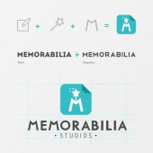
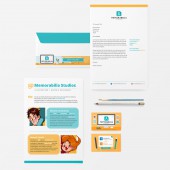
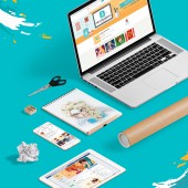
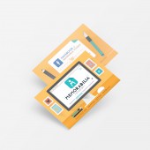
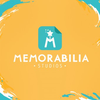
| DESIGN NAME: Memorabilia Studios PRIMARY FUNCTION: Corporate Identity INSPIRATION: Inspiration came from brand’s name, chosen to represent the main activity of the brand: hand-made illustrations made of paper (actual objects) which should have portrayed some particular moments in animated movies’ stories. Since we wanted to express the idea of making magic with and on paper, we chose a symbol which summarises the whole brand’s mood, its name and its meaning. UNIQUE PROPERTIES / PROJECT DESCRIPTION: The brand is characterized for the simplicity of its shapes, its awareness and mostly the facility to recognize and remember it. Its strong point is the capacity to combine the animated world, expressed by the magic wand in the symbol, with a professional and modern style, expressed by the logotype. Everything is placed within a context of complementary, warm and lively colors. OPERATION / FLOW / INTERACTION: Thanks to its versatility and to the subjects of the works on which it shall be applied, the brand has been used as a sort of signature by the two artists of the team, in addition to all its classic applications on paper (business cards, letter envelope, letterhead, stickers) and digital supports (social media, videos, etc.) PROJECT DURATION AND LOCATION: The brand was created between May and July 2014 FITS BEST INTO CATEGORY: Graphics, Illustration and Visual Communication Design |
PRODUCTION / REALIZATION TECHNOLOGY: Many sketches on paper were made to reach the final result. After defining the general idea, the most convincing solutions were digitalized with a scanner and rebuilt with vector shapes on Adobe Illustrator. The Logotype was created combining two different, modern and geometric sans-serif fonts, successively customized in their vector paths. SPECIFICATIONS / TECHNICAL PROPERTIES: Business card: 85mm x 55mm Letter envelope: 230 mm x 115 mm Letterhead: 210 mm x 297 mm TAGS: Brand, Identity, Corporate, Business, Logo, Handmade, Craft, Paper, Magic, Yellow, Blue RESEARCH ABSTRACT: To create Memorabilia studios’ brand we thought of how to reach the right target audience and to how it could recognize and easily memorize it. To draw the attention of kids and boys/girls from twelve years upwards we chose a vivid and warm shade of yellow and its complementary blue and easy to recognise symbols like a folded sheet of paper or a magic wand. CHALLENGE: The main difficulty was creating a logo which couldn’t be attribute to an excessively serious firm image, to something impersonal and mass-produced. We wanted to convey, in a direct, simple and happy way, the handmade nature of all the artistic works using and emphasizing the modern trend of flat graphics at the same time. ADDED DATE: 2017-09-11 09:43:46 TEAM MEMBERS (3) : Designer: Matteo Innominato, Designer: Alessia Tatulli and IMAGE CREDITS: Matteo Innominato Alessia Tatulli PATENTS/COPYRIGHTS: Copyrights belong to Alessia Tatulli and Matteo Innominato, 2017. |
||||
| Visit the following page to learn more: https://www.facebook.com/memorabiliastud |
|||||
| AWARD DETAILS | |
 |
Memorabilia Studios Corporate Identity by Matteo Innominato and Alessia Tatulli is Winner in Graphics, Illustration and Visual Communication Design Category, 2017 - 2018.· Read the interview with designer Matteo Innominato and Alessia Tatulli for design Memorabilia Studios here.· Press Members: Login or Register to request an exclusive interview with Matteo Innominato and Alessia Tatulli. · Click here to register inorder to view the profile and other works by Matteo Innominato and Alessia Tatulli. |
| SOCIAL |
| + Add to Likes / Favorites | Send to My Email | Comment | Testimonials | View Press-Release | Press Kit |
Did you like Matteo Innominato and Alessia Tatulli's Graphic Design?
You will most likely enjoy other award winning graphic design as well.
Click here to view more Award Winning Graphic Design.


