The Landscape the Tropics Never Had Identity by Qingyu Wu |
Home > Winners > #59430 |
 |
|
||||
| DESIGN DETAILS | |||||
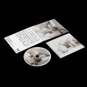
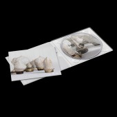
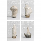
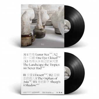
| DESIGN NAME: The Landscape the Tropics Never Had PRIMARY FUNCTION: Identity INSPIRATION: Inspired from the photography of this album cover, it called Desserts by artist Li Gang. In his work, the hair was randomly swept up and mixed with plaster, according to traditional construction methods, to produce anonymous construction materials. I used western and eastern typefaces which both have similar structure as the sculpture in the background photography. For example, using the tenuous Chinese fonts to represent the hair in the sculpture and the odic atmosphere of the music. UNIQUE PROPERTIES / PROJECT DESCRIPTION: Chui Wan is an experimental psychedelic rock band who asked me to create art work for their new album, The Landscape the Tropics Never Had. I created this bilingual visual identity draws upon the soft tone of photography and the unique mix of calligraphic and typographic form to represent the tracks ambiguous, poetic, and textural melodies. Created artwork for the CD, cassette tape, t-shirts, posters, banners, and the 12-inch record, which was included with a limited edition press of the vinyl. OPERATION / FLOW / INTERACTION: Music has always been an important aspect of my practice, I have made my way on projects, working with musicians, artists and performers. The design of the album and the music have a undeniably evolved feeling, as has the culture around it. I believe when we work together, it all come together as a whole which could give the viewer a fresh and unique experience from musically and visually. PROJECT DURATION AND LOCATION: The project started in December 2016 in Beijing and finished in August 2017 in New York City, and all printed matter of the album will be published and released on September 1 on Maybe Mars, and marked with a live return to Yugong Yishan in Beijing on the same day, a reception, album sale and signing will follow the live. FITS BEST INTO CATEGORY: Graphics, Illustration and Visual Communication Design |
PRODUCTION / REALIZATION TECHNOLOGY: The beautiful cover photography created by Li Gang at Galerie Urs Meile in Beijing. I created the bilingual visual identity draws upon the soft tone of photography and the unique mix of calligraphic and typographic form to represent the tracks’ ambiguous, poetic, and textural melodies. All work was start from a pencil sketch into a digital file for processing using a scanner, Adobe Photoshop, Illustrator, and Indesign. These sketches became a reference point for the final work. I worked, experimented, and tested different ideas always relate with the music itself and the meaning of the lyric from the songs. At the same time, worked on printing production and communication with the client and the band. All physical products will be published and released on September 1, 2017 on Maybe Mars Record in Beijing. SPECIFICATIONS / TECHNICAL PROPERTIES: Vinyl: Width 304.8 mm x Depth 4.8 mm x Height 304.8 mm; CD digipack: Width 139 mm x Depth 7.112 mm x Height 126 mm; Cassette: Width 65.024 mm x Depth 12.7 mm x Height 101.6 mm; Posters: Width 594 mm x Height 841 mm TAGS: Branding, Identity, Graphic Design, Record Design, Art Direction, Album Design RESEARCH ABSTRACT: I am a Krautrock music lover and like to watch music documentary and to research things I am very interested in. In the beginning steps of doing album design for band Chui Wan, I was listening their new songs almost everyday because I want to experiences and understanding their music and inner world first. So listen and research the lyric of their songs, resulted in an accumulation of many sketches and ideas, like writing. Later, these sketches and feelings became a reference point for the final work. Another important influence is from the beautiful cover art Desserts created by Li Gang at Galerie Urs Meile in Beijing. In his work, the hair was randomly swept up and mixed with plaster, according to traditional construction methods, to produce anonymous construction materials. With this Desserts Li Gang succeeds at precisely analysing the contemporary phenomenon of worker migration inside of China. I really like the ideas and materials he uses and reveals to the viewer in his work. Inspired from Gang's work, I used western and eastern typefaces which both have similar structure as the sculpture in the background photography. Like the tenuous FZ Lan Ting Hei S UL GB fonts by Founder Group to represent the hair in the sculpture; Title of the poster used Ogg by Sharp Type to express the vague feeling and odic atmosphere of the band's music. The bilingual visual identity draws upon the soft tone of photography and the unique mix of calligraphic and typographic form to represent the tracks ambiguous, poetic, and textural melodies. CHALLENGE: I would say the hardest part of this design is not type setting, correct colors, and visual refinement. I have come to realize the hardest part of design is figuring out the concept, strategy, content, and flow. Especially, testing concepts, and doing the whole thing over again. It's the hardest part for me. ADDED DATE: 2017-08-12 00:33:47 TEAM MEMBERS (1) : IMAGE CREDITS: Image #No 1 : Photographer / Artist, Li Gang, Desserts, 2016. Image #No 2 : Photographer / Artist, Li Gang, Desserts, 2016. Image #No 3 : Photographer / Artist, Li Gang, Desserts, 2016. Image #No 4 : Photographer / Artist, Li Gang, Desserts, 2016. Image #No 5 : Photographer / Artist, Li Gang, Desserts, 2016. PATENTS/COPYRIGHTS: Copyrights belong to Qingyu Wu, 2017. |
||||
| Visit the following page to learn more: http://qingyuwu.com/ | |||||
| AWARD DETAILS | |
 |
The Landscape The Tropics Never Had Identity by Qingyu Wu is Winner in Graphics, Illustration and Visual Communication Design Category, 2017 - 2018.· Read the interview with designer Qingyu Wu for design The Landscape the Tropics Never Had here.· Press Members: Login or Register to request an exclusive interview with Qingyu Wu. · Click here to register inorder to view the profile and other works by Qingyu Wu. |
| SOCIAL |
| + Add to Likes / Favorites | Send to My Email | Comment | Testimonials | View Press-Release | Press Kit |
Did you like Qingyu Wu's Graphic Design?
You will most likely enjoy other award winning graphic design as well.
Click here to view more Award Winning Graphic Design.


