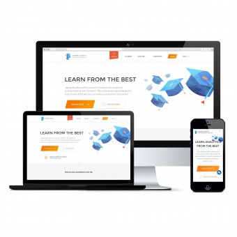
Jigsaw Academy Website User Experience by Aashish Solanki - NetBramha Studios LLP |
Home > Winners > #59120 |
 |
|
||||
| DESIGN DETAILS | |||||
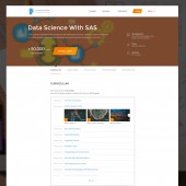
| DESIGN NAME: Jigsaw Academy PRIMARY FUNCTION: Website User Experience INSPIRATION: 1. Detailed User Research conducted that gave us insights 2. Student Learning Matrix 3. On the job learning experiences of the users 4. Social & Physital Learning experiences UNIQUE PROPERTIES / PROJECT DESCRIPTION: Project Impact: 1. The website is generating 534 percent more leads (actual conversions) every month post the redesign. 2. The design has helped Jigsaw stamp its leadership in the analytics training. Users have an enriched analytics learning experience which spells trust, credibility and brilliance all together. 3. Pages per session has gone up by 13 percent. 4. The overall discoverability and usability has gone up resulting in higher conversion rates. 5. Session duration has gone up by 6 percent 6. Bounce rate has fallen by 7 percent OPERATION / FLOW / INTERACTION: The entire website is designed around the user goals 1. Understanding the analytics space as a job market 2. Identifying what course & course paths are best suited for a candidate The interaction and flow on the website are designed to address the above 2 goals. Right from the homepage where the user has a quick 6 sec guided questionnaire that gives instant gratification to the user to a very clean checkout process to deliver higher conversions. 1. Fully responsive website 2. Minimal design - Maximum results 3. Structured content modelling 4. Guided navigation & discovery of content PROJECT DURATION AND LOCATION: The research of the project was done over 8 weeks across 2 locations and around 50 users. The design phase of the project took about 16 weeks which included information architecture, wireframing, prototyping, user interface design & front end development. The new site went live in mid 2016 from Bangalore, India. FITS BEST INTO CATEGORY: Interface, Interaction and User Experience Design |
PRODUCTION / REALIZATION TECHNOLOGY: 1. Research Qualitative & quantitative methods of design were employed on 50 users to arrive at insights that would drive the design 2. Design - Information Architecture was generated based on the insights & goals. We focussed on both ideal & edge cases for user success journeys - Wireframes and prototypes were designed in sprints & iterated every week. - User interface and brand guidelines for all pages and flows were designed with front end development and responsive design in mind for all mediums (web, tablet, mobile etc) - W3C validated front end hand crafted code was delivered to realise the final website SPECIFICATIONS / TECHNICAL PROPERTIES: 1. User Centered design following UX design principles 2. Jakob Nielsen design heuristics 3. W3C validated HTML,CSS TAGS: UX, UI, Analytics, Web, Responsive, User Research, Design Thinking RESEARCH ABSTRACT: 50 User were researched - 25 existing users & 25 potential users Both qualitative and quantitative design methods were used. Interviews, Web Task analysis, Group Discussion, Card Sorting The detailed research report is under NDA & confidentiality. Highlights 1. 3 main user personas were developed based on the research 2. 48 content buckets were reduced to 24 and bucked into just 5 main labels 3. User conversion & engagement goals were clearly articulated CHALLENGE: 1. Effective lead generation on the website was very low 2. Lots of ad money was being spent to direct traffic towards Free Trial 3. Customers were unaware of analytics, related tools and technologies 4. Jigsaw website didn’t work well on mobile screen 5. Expensive courses and also general turnaround time for customers was 3 months 6. The bounce rate was high as the information was not structurally placed on the website 7. Stronger brand positioning & recall needed before the marketing spend ADDED DATE: 2017-07-25 11:38:03 TEAM MEMBERS (5) : Aashish Solanki, Bharat KV, Anklt Puniya, Vaishnavi and IMAGE CREDITS: NetBramha Studios LLP PATENTS/COPYRIGHTS: Design IP: NetBramha Studios LLP & Jigsaw Academy Pvt Ltd. |
||||
| Visit the following page to learn more: http://bit.ly/2yOWPlA | |||||
| AWARD DETAILS | |
 |
Jigsaw Academy Website User Experience by Aashish Solanki-Netbramha Studios Llp is Winner in Interface, Interaction and User Experience Design Category, 2017 - 2018.· Read the interview with designer Aashish Solanki - NetBramha Studios LLP for design Jigsaw Academy here.· Press Members: Login or Register to request an exclusive interview with Aashish Solanki - NetBramha Studios LLP. · Click here to register inorder to view the profile and other works by Aashish Solanki - NetBramha Studios LLP. |
| SOCIAL |
| + Add to Likes / Favorites | Send to My Email | Comment | Testimonials | View Press-Release | Press Kit |
Did you like Aashish Solanki-Netbramha Studios Llp's Interface Design?
You will most likely enjoy other award winning interface design as well.
Click here to view more Award Winning Interface Design.


