Matcha Me Brand Identity by Daria Berezneva |
Home > Winners > #58990 |
 |
|
||||
| DESIGN DETAILS | |||||
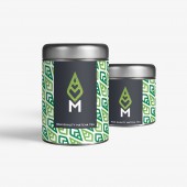
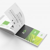
| DESIGN NAME: Matcha Me PRIMARY FUNCTION: Brand Identity INSPIRATION: The logo showcases a green tea leaf with a heart in the middle made by negative space. This represents "Love for Matcha", the main value behind MatchaMe. The leaf symbol firmly sits on a letter "M" creating a Matcha Me icon used across all the packaging. The letter "A" has been modified to follow the same shape as the top area of the leaf symbol, creating a consistent and balanced look. UNIQUE PROPERTIES / PROJECT DESCRIPTION: Matcha Me is an Australian brand that has love for Matcha tea at its core. Its mission is to bring premium Matcha powder straight to the customer direct from the farm in the Uji region of Kyoto Japan; were the best tasting Matcha in the world is produced. OPERATION / FLOW / INTERACTION: This brand sums up in a clear and modern form the true values of Matcha Me company. It carries all colours and shapes consistently through all the elements and conveys the brand successfully to the customer. PROJECT DURATION AND LOCATION: This project started in April 2017 and finished in May 2017. FITS BEST INTO CATEGORY: Graphics, Illustration and Visual Communication Design |
PRODUCTION / REALIZATION TECHNOLOGY: SPECIFICATIONS / TECHNICAL PROPERTIES: Matcha Me was in search of an identity that represents its true core; best tasting Matcha powder from the Uji region of Kyoto and a big love for Matcha tea. The new brand reflects a fresh and clean approach keeping the main element "love for Matcha" at its heart. TAGS: Branding, Identity, Matcha, Tea, Packaging, Logo, Green Tea, Font RESEARCH ABSTRACT: The logo showcases a green tea leaf with a heart in the middle made by negative space. This represents "Love for Matcha". The colour palette is originally based on the Matcha powder, its composed by two shades of green and used in combination with white or dark grey colour depending on the background. The leaf symbol firmly sits on a letter "M" creating a Matcha Me icon version of the logo. The letter "A" has been modified to follow the same shape as the top area of the leaf symbol, creating a consistent and balanced look. CHALLENGE: As this company is very young, they were still trying to figure their core values and what makes them who they are. This meant that all this information was still to be discovered, so we had to go on a journey and figure out what made them so special. ADDED DATE: 2017-07-17 11:46:30 TEAM MEMBERS (1) : IMAGE CREDITS: Daria Berezneva, 2017. |
||||
| Visit the following page to learn more: http://www.fullbundle.com/projects/match |
|||||
| AWARD DETAILS | |
 |
Matcha Me Brand Identity by Daria Berezneva is Winner in Graphics, Illustration and Visual Communication Design Category, 2017 - 2018.· Press Members: Login or Register to request an exclusive interview with Daria Berezneva. · Click here to register inorder to view the profile and other works by Daria Berezneva. |
| SOCIAL |
| + Add to Likes / Favorites | Send to My Email | Comment | Testimonials | View Press-Release | Press Kit |


