Sacla Redesign Pasta Sauce by QNY Creative |
Home > Winners > #58863 |
 |
|
||||
| DESIGN DETAILS | |||||
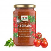
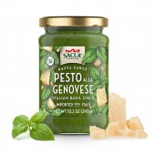
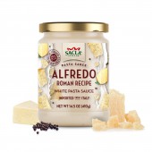
| DESIGN NAME: Sacla Redesign PRIMARY FUNCTION: Pasta Sauce INSPIRATION: Fruit crate labels were a frequent means of marketing fruit packer brands at the turn of the century. The design is inspired by the artwork from California and Florida, from the 1920s and 1940s. UNIQUE PROPERTIES / PROJECT DESCRIPTION: The new label designs feature transparent film and eye-catching illustrations that breaks from the usual codes of the category. The transparent label allows you to bond with the product to view the quality 360. We chose the hand painted illustrations, which are inspired by fruit crate labels. The contrast of the vintage inspired art work and modern labeling techniques gives the shopper a sense of warm tradition and premiumness. OPERATION / FLOW / INTERACTION: The concept’s originality produced a warm, appealing identity and packaging that leaps out. This attention to detail is echoed in the label’s graphic layout, which was developed around the Product name and the illustration composition is unique to each sauce. PROJECT DURATION AND LOCATION: The project was started in New York and completed in six months. FITS BEST INTO CATEGORY: Packaging Design |
PRODUCTION / REALIZATION TECHNOLOGY: Transparent Over Label - Gloss Laminate SPECIFICATIONS / TECHNICAL PROPERTIES: Glass Jar, Circular top label and primary display transparent label 3.5 x 9 inches TAGS: Jar, Pasta Sauce, Tomato, Cherry Tomato, Italian Food RESEARCH ABSTRACT: Prior to the packaging redesign Sacla Sauces went through consumer focus group testing with a white circular die-cut label portraying the ingredient varietals in a kaleidoscopic composition. The focus group results were positive for the Sauces, but negative for the esthetic of the packaging. The overall design of the previous label was considered "too cold.” Sacla tasked QNY Creative, who specializes in specialty food with vast experience in Italian brand crossovers to provide a design that would show off the whole cherry tomatoes in their Tomato Sauces and make an authentic Italian product range feel familiar to new consumers. Celebrating the product quality, authenticity and flavors. CHALLENGE: There is nothing more traditionally Italian than Cherry Tomatoes, but when Sacla wanted to reintroduce their premium ready-to-serve sauce products to the North America they asked QNY to provide a design that would show off the whole cherry tomatoes in their Tomato Sauces and make an authentic Italian product range feel familiar to new consumers. To break through the clutter of the premium sauce category, overloaded with portraits of traditional Italian chefs, QNY used an image of Sacla’s young heiress, Chiara Ercole. This point celebrated the new Italian business woman and rounded out our goal, to make the line resonate with the new American consumer, particularly young moms who will bring homegrown Italian flavors to their dinner tables. ADDED DATE: 2017-07-07 23:04:18 TEAM MEMBERS (7) : Creative Agency: QNY Creative, Lead Designer: Iker Iza, Samantha Clemente, Creative Director: Ezio Burani , Illustrator: Doug Schneider , Project Type: Produced, Commercial Work, Client: Sacla USA and Location: New York, USA IMAGE CREDITS: Samantha Clemente PATENTS/COPYRIGHTS: QNY Creative, 2017 |
||||
| Visit the following page to learn more: http://www.sacla.us/products/ | |||||
| AWARD DETAILS | |
 |
Sacla Redesign Pasta Sauce by Qny Creative is Winner in Packaging Design Category, 2017 - 2018.· Read the interview with designer QNY Creative for design Sacla Redesign here.· Press Members: Login or Register to request an exclusive interview with QNY Creative. · Click here to register inorder to view the profile and other works by QNY Creative. |
| SOCIAL |
| + Add to Likes / Favorites | Send to My Email | Comment | Testimonials | View Press-Release | Press Kit |
Did you like Qny Creative's Packaging Design?
You will most likely enjoy other award winning packaging design as well.
Click here to view more Award Winning Packaging Design.


