Castello 4 Fine Dining Restaurant by Michael Liu |
Home > Winners > #58801 |
 |
|
||||
| DESIGN DETAILS | |||||
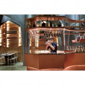
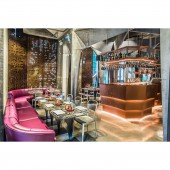
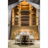
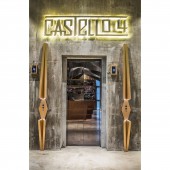
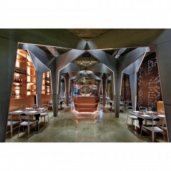
| DESIGN NAME: Castello 4 PRIMARY FUNCTION: Fine Dining Restaurant INSPIRATION: Given the fact that it is located inside a commercial building, there needs to be a way to attract guests and maximize covers for its owners. The designer decided to create astounding visual impact the moment elevator doors open in order to attract potential customers. UNIQUE PROPERTIES / PROJECT DESCRIPTION: The ingenious use of symmetrical pattern and different set of lighting creates a stunning visual effect for this restaurant/bar and gives this ordinary commercial unit its own distinctive character. OPERATION / FLOW / INTERACTION: The original finishing of the space is retained to minimize the construction cost, adding to it are the cement board pillars and rusty plates that match perfectly with the existing concrete walls, giving it a raw and authentic feel. Rusty screens with laser-cut triangular pattern are placed in front of the large windows to conceal the discordant views and the structure of the building facade, yet ensuring that the space is still illuminated by natural light. PROJECT DURATION AND LOCATION: Castello 4 is a restaurant/bar located in the heart of Hong Kong with a total area of 2,200 square feet. The project was completed on 10 June 2015. FITS BEST INTO CATEGORY: Interior Space and Exhibition Design |
PRODUCTION / REALIZATION TECHNOLOGY: The design starts from the center line of the space and used a bi-folding concept to create a symmetrical pattern in the shape of a vaulted ceiling, unusually designed with pillars in the shape of an inverted triangle. The designer aims to emphasize the height of the ceiling to create space illusion. SPECIFICATIONS / TECHNICAL PROPERTIES: This project area is 2,200 square feet. TAGS: Fine Dining, Restaurant, Edgy, Hong Kong, Bar RESEARCH ABSTRACT: To set the design direction, the designer need to understand and analyze the catering market. Castello 4 located in one of the busiest district in Hong Kong, inside a building that is included all different kind of restaurants. Facing so many competitors, the designer need to make the restaurant stand out and be extraordinary to attract more customers. Through interviews, the clients shared their visions and their goals, they wanted this to be a fine dining restaurant, serving refined and exquisite dishes. Match with the name of the restaurant, “Castello”, the Italian of Castle, unlike the ordinary luxury and glorious castle. The owners wanted the restaurant to be subtle, yet unique. Also, the clients wanted to keep it within the budget. Take all these comments and consideration into account, the designer started to build an architectural model with cardboard, to try out the bi-folding concept. After a few alternation, the design had finally came up. The design starts from the center line of this space and used a bi-folding concept to create a symmetrical pattern in the shape of a vaulted ceiling, unusually designed with pillars in the shape of an inverted triangle. The designer aims to emphasize the height of the ceiling to create space illusion. With effective use of a 5-meter high ceiling, the designer successfully transforms a unit within an ordinary building into a revolutionary hall with the intention to amaze and draw attention in an instant. This is especially important as there are literally only seconds for a person to catch a glimpse of it when they are passing by inside an elevator. CHALLENGE: With effective use of a 5-meter high ceiling, the designer successfully transforms a unit within an ordinary building into a revolutionary hall with the intention to amaze and draw attention in an instant. This is especially important as there are literally only seconds for a person to catch a glimpse of it when they are passing by inside an elevator. ADDED DATE: 2017-07-04 06:59:48 TEAM MEMBERS (1) : IMAGE CREDITS: All photo credits to Millimeter Interior Design Limited. |
||||
| Visit the following page to learn more: http://www.millimeter.com.hk | |||||
| AWARD DETAILS | |
 |
Castello 4 Fine Dining Restaurant by Michael Liu is Winner in Interior Space and Exhibition Design Category, 2017 - 2018.· Press Members: Login or Register to request an exclusive interview with Michael Liu. · Click here to register inorder to view the profile and other works by Michael Liu. |
| SOCIAL |
| + Add to Likes / Favorites | Send to My Email | Comment | Testimonials | View Press-Release | Press Kit |

