Existing White Exhibition Design by Robin Wang |
Home > Winners > #58362 |
 |
|
||||
| DESIGN DETAILS | |||||
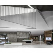
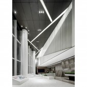
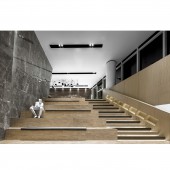
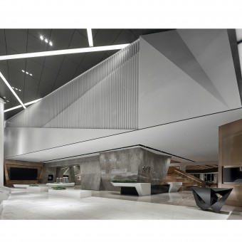
| DESIGN NAME: Existing White PRIMARY FUNCTION: Exhibition Design INSPIRATION: The inspiration of this project design from a public library, leave more public space for the possibility of different functions and events, like salons, public reading room, maybe a theater for an opera. Due to the unique structure of the architect, the designer tried to magnify sculpt by using stereo wall and ceiling decoration. While keep the balance of the advanced composite functional interior design and the special architect. UNIQUE PROPERTIES / PROJECT DESCRIPTION: The white decoration wall used white based wood and steel to feature the clean and comfort space atmosphere .The wooden staircase not only use for level intersection, but also for causal gathering and small events, this can be a multi-function area for social activities while an excellent show effect. OPERATION / FLOW / INTERACTION: The entrance of a triangular space, mainly as an atmosphere of an art museum, is actually a brand display of the group, with high and low white showcases, plus 10 meters high white fluorocarbon pillars ,pure white high space to change the image of commercial real estate sales department in the past, refreshing people. The key to the design is to communicate with the manufacturer fully. It solves the problem and becomes another highlight of the whole indoor space. PROJECT DURATION AND LOCATION: The project started in Sep 2015 and finished in June 2016 in Quanzhou,Fujian Province FITS BEST INTO CATEGORY: Interior Space and Exhibition Design |
PRODUCTION / REALIZATION TECHNOLOGY: Stair-step designed public area.Geometric surface,Dimension stone SPECIFICATIONS / TECHNICAL PROPERTIES: Wall body large area stone multifaceted cutting and the whole space is focused on the large staircase in the middle. The ground uses different materials to separate different functional spaces. TAGS: Morden,Concise Style,Exhibition Design RESEARCH ABSTRACT: The first and second floor of the building is a sales exhibition area, and three or four floors are offices. On the inside of the second floor, a triangle is formed into a high hall, and a "back" line is organized around a second floor. Space is open, free and fluid, and the experience of human beings is casual, varied and diverse. CHALLENGE: The whole space is focused on the large staircase in the middle. The ground uses different materials to separate different functional spaces. ADDED DATE: 2017-06-17 10:19:23 TEAM MEMBERS (2) : Architect:ZHUBO DESIGN and Landscape:SIA and IMAGE CREDITS: Example: Image #1: Photographer Ming Xu, 2016. ] Please note that: Main image is Image #1, Optional Image #1 is Image #2, Optional Image #2 is Image #3, Optional Image #3 is Image #4, Optional Image #4 is Image #5. |
||||
| Visit the following page to learn more: http://www.snp-group.net | |||||
| AWARD DETAILS | |
 |
Existing White Exhibition Design by Robin Wang is Winner in Interior Space and Exhibition Design Category, 2017 - 2018.· Press Members: Login or Register to request an exclusive interview with Robin Wang. · Click here to register inorder to view the profile and other works by Robin Wang. |
| SOCIAL |
| + Add to Likes / Favorites | Send to My Email | Comment | Testimonials | View Press-Release | Press Kit | Translations |

