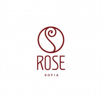
Rose Sofia Logo by Ivan Radev |
Home > Winners > #58246 |
| CLIENT/STUDIO/BRAND DETAILS | |
 |
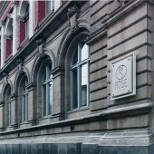
NAME: Rose Sofia PROFILE: Found in one of most popular places in Sofia, Bulgaria, the old central part in the city in a building with a perfect combination of architecture and style from the past century.At the front door, we enter into another dimension. Rose Sofia occupies the former territory of Bulgarian Rose on Ivan Vazov Str - it's a place with high ceilings and a remarkable interior. The authentic appearance of the building is preserved outside, and inside the rooms are cozy, calm and arranged with taste. The air is filled with soft music and aromas, which bears a shadow of the previous life of the place. When you want to relax, get away from the city, and then jump back in to it.The idea is to be a place for a cocktail party on Friday evening and a business lunch during the week. |
| AWARD DETAILS | |
 |
Rose Sofia Logo by Ivan Radev is Winner in Graphics, Illustration and Visual Communication Design Category, 2017 - 2018.· Press Members: Login or Register to request an exclusive interview with Ivan Radev. · Click here to register inorder to view the profile and other works by Ivan Radev. |
| SOCIAL |
| + Add to Likes / Favorites | Send to My Email | Comment | Testimonials | View Press-Release | Press Kit |


