Honey of the Messestadt Packaging by Joel Derksen |
Home > Winners > #57656 |
 |
|
||||
| DESIGN DETAILS | |||||
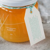
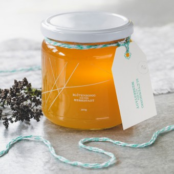
| DESIGN NAME: Honey of the Messestadt PRIMARY FUNCTION: Packaging INSPIRATION: The tree-lined bike paths that connect the community are entirely unique to the Messestadt area, and a source of pride for those who live there. It seemed only natural, then, to hearken back to those long, thin lines of one-time runways and taxiways to create the label and supporting brand identity. UNIQUE PROPERTIES / PROJECT DESCRIPTION: In 1992, visionary planners transformed an abandoned Munich airport into an “eco-utopian” community. Concrete runways were replaced with tree-lined bike paths. Today, residents of this car-less district invest in projects that directly benefit the community. With only 30 jars of this special honey made each year, it was critical to bring the story of this special community to life in the packaging. OPERATION / FLOW / INTERACTION: The key to this design is capturing a community spirit that legitimises the hard work of the beekeeper; allowing the honey to be shared and gifted since it feels safe and professional. PROJECT DURATION AND LOCATION: Started in October 2013 and finished April 2014 in Munich, Germany. FITS BEST INTO CATEGORY: Packaging Design |
PRODUCTION / REALIZATION TECHNOLOGY: Clear label with white screen print. Two rubber stamps and pre-made labels for the tag. SPECIFICATIONS / TECHNICAL PROPERTIES: Label design size is 273mm x 50mm, on a jar holding approximately 230ml of honey. White screenprinting ink used on clear wrap-around labels, with blue-white twine and standard tag, text applied with a rubber stamp. TAGS: Honey, Packaging, ecological, community, boutique, small-run RESEARCH ABSTRACT: Research here was simple: The beekeeper, Birgit, spent an afternoon with me walking around the neighbourhood, sharing stories and telling me the architectural and developmental history of the area. On our way, we met neighbours who shared their stories. Direct experience here provided the best insight and experience. CHALLENGE: Over 60 other conceptual and visual explorations to be assured this was the right direction. Once the concept was selected, material research involved the type and quality of line-work to capture the map of the Messestadt area, including pen, charcoal and digital options. In the end, inspiration was taken from cartography and hand-drawn maps, where lines were perfectly straight but still retained visual friction of a moving pen. With a small production run, the main challenge involved how much time the beekeeper, Birgit, would be willing to invest in things like stamping tags, or signing limited editions, and how to manage a modest budget. ADDED DATE: 2017-04-08 21:25:18 TEAM MEMBERS (3) : Writer: Jason Thomas, Photographer: Lina Skukauskė and IMAGE CREDITS: Image #1: Photographer Photographer: Lina Skukauskė Image #2: Photographer Photographer: Lina Skukauskė Image #3: Photographer Photographer: Lina Skukauskė Image #4: Photographer Photographer: Lina Skukauskė Image #5: Photographer Photographer: Lina Skukauskė |
||||
| Visit the following page to learn more: http://goo.gl/TA258c | |||||
| AWARD DETAILS | |
 |
Honey of The Messestadt Packaging by Joel Derksen is Winner in Packaging Design Category, 2017 - 2018.· Press Members: Login or Register to request an exclusive interview with Joel Derksen. · Click here to register inorder to view the profile and other works by Joel Derksen. |
| SOCIAL |
| + Add to Likes / Favorites | Send to My Email | Comment | Testimonials | View Press-Release | Press Kit |

