Publicitários Criativos Corporate Identity by Pedro Panetto |
Home > Winners > #57273 |
 |
|
||||
| DESIGN DETAILS | |||||
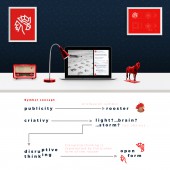
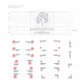
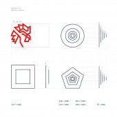
| DESIGN NAME: Publicitários Criativos PRIMARY FUNCTION: Corporate Identity INSPIRATION: The project sought to inspire and convey two concepts: Advertising and Creativity. The rooster, even in its abstracted form, symbolizes for being the symbol of publicity and the form to be broken, symbolizes the disruptive thought that relates conceptually with the creativity. In addition to these two main aspects of advertising and creativity, the brand sought to express an energetic, young and powerful image. UNIQUE PROPERTIES / PROJECT DESCRIPTION: Publicitarios Criativos is the biggest advertising blog in Brazil, with more than half a million followers and it also acts as a marketing and social media company. His Visual Identity was created with a strong proportional, symbolic and flexible work. Since the symbol until the dozens of variations of visual signatures, all have been heavily based on the Golden Ratio. No single piece was created with the Golden Ratio, but rather a whole system according to golden reason. OPERATION / FLOW / INTERACTION: The proper functioning of this Visual Identity is due to its high variety of applications and to its symbol that has a different and striking shape. This influences and works well in your main application of your website and social networks, where the dispute for attention is very strong. With this symbol, social media has become stronger and visually striking. PROJECT DURATION AND LOCATION: The project began in September 2016 and ended in November 2016. It was developed in the city of Vitória, State of Espirito Santo, Brazil. The project was presented on November 17, 2016 by 30 Brazilian communication blogs, reaching an audience of 1,000,000 people on the same day. FITS BEST INTO CATEGORY: Graphics, Illustration and Visual Communication Design |
PRODUCTION / REALIZATION TECHNOLOGY: Sketches, brainstorms and mind maps were central to the conceptual phase and to the generation of ideas. After choosing the concept of form, the project went through Adobe Illustrator, Adobe Photoshop and the application of the Golden Ratio in its final form. SPECIFICATIONS / TECHNICAL PROPERTIES: The project doesn't have a specific measure or size because it's a brand. But for sizing purposes we can understand that their proportional ratios maintains in Phi, which is approximately 1,618, the Golden Ratio. TAGS: Logo, Golden Ratio, Phi, Symbol, corporate identity RESEARCH ABSTRACT: It was necessary to convey the idea of publicity and creativity. For publicity it was relatively simple to use the rooster that is already a consecrated symbol of the profession in Brazil. But he needed an abstract charge to strengthen himself as a single symbol. After testing, it was decided to use pure and firm lines. The creativity has been more difficult to symbolize, we achieve this through a relationship in a broken way with the idea of disruptive thinking that is associated with creativity. CHALLENGE: The biggest challenge was in relation to its public, composed of Advertisers and students of related areas. It's not an easy audience. Fortunately the results were excellent. On the day of the launch, the Facebook page of the company had an increase of 5 thousand followers. The project was discussed by numerous people on social networks and we had reports of discussions in colleges. We achieved the goal of a remarkable Visual Identity, with the ability to generate discussions and thus self-strengthen. ADDED DATE: 2017-03-30 17:48:00 TEAM MEMBERS (1) : IMAGE CREDITS: Pedro Panetto, 2016. |
||||
| Visit the following page to learn more: http://bit.ly/sitePCriativos | |||||
| AWARD DETAILS | |
 |
Publicitários Criativos Corporate Identity by Pedro Panetto is Winner in Graphics, Illustration and Visual Communication Design Category, 2016 - 2017.· Press Members: Login or Register to request an exclusive interview with Pedro Panetto. · Click here to register inorder to view the profile and other works by Pedro Panetto. |
| SOCIAL |
| + Add to Likes / Favorites | Send to My Email | Comment | Testimonials | View Press-Release | Press Kit |

