DESIGN NAME:
Han Sip
PRIMARY FUNCTION:
Korea healthy tea cafe branding
INSPIRATION:
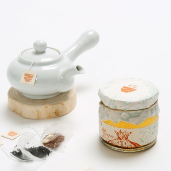
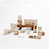
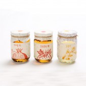
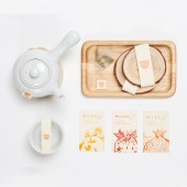
Many years ago, Korean traditional tea was used as a medicine when it was sick.Each has one or more advantages.Inspired by the inspiration of Korea, I built a brand named jeontongcha.Because fruit has different effect, package tries to represent various colors and various illustration.
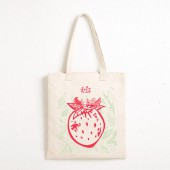
Among the menus, ‘dodam dodam ’ is mixing tea and these main ingredients is Strawberries and Omija. It is beneficial to mix and match the fruits to relieve fatigue and protect the respiratory tract.
UNIQUE PROPERTIES / PROJECT DESCRIPTION:
Recently, interest in health care has increased due to environmental concerns.
It is a brand that wants to give healthy rest to modern people who are not easy to take care of health.
It is a traditional Korean fruit cafe which is made with Korean fruits and tradition.
Instead of adding syrup to the drink, put honey in a Korean traditional way.
OPERATION / FLOW / INTERACTION:
When I made healthy tea, I got a sense of intimacy. The package paper is made from organic paper called 'Crush' which is often sold in the ward. It is a non-wood pulp made from organic residues and made from the remaining residue. The image of a brand that thinks about traditional Korean health tea and environment
PROJECT DURATION AND LOCATION:
The project started in March 2016 in Seoul and finished in September 2016 in Sungnam, and was exhibited in Daehak-ro,Seoul in September 2016
FITS BEST INTO CATEGORY:
Packaging Design
|
PRODUCTION / REALIZATION TECHNOLOGY:
Because of the fact that it is a cafe for people's health, We use eco friendly paper to recycle food. We think of not only human health but also the environment.
And the bottle caps, the traditional Korean paper was used.
These papers and package make our brand more robust.
SPECIFICATIONS / TECHNICAL PROPERTIES:
small box : 90mm x 90mm x 80mm
middle box : 80mm x 80mm x 120mm
large box : 75mm x 75mm x 170mm
made a package with origami.
TAGS:
Korea, Treditional , Tea, package, fruit
RESEARCH ABSTRACT:
I thought how important it is to attract consumers' interest in package design. Recently, the awareness of health is increasing due to yellow sand or rapid climate change. Since ancient times in Korea, I have used fruits and root vegetables to treat diseases. I used these fruits and root vegetables to make a Korean traditional tea brand. But I felt that the feeling of being too traditional does not reach the younger generation. So I made a package design by drawing illustrations of the fruits in each tea.
CHALLENGE:
I had a lot of worries about how I could save Korean feelings.
I also research a lot of Korean traditional patterns.
ADDED DATE:
2017-03-26 15:42:50
TEAM MEMBERS (2) :
Designer: Mira Kim and Designer: Mihyun Kim
IMAGE CREDITS:
Image #1 : Illustrator , Mira Kim , Mihyun Kim, 2016
Image #2 : Illustrator , Mira Kim , Mihyun Kim, 2016
Image #3 : Illustrator , Mira Kim , Mihyun Kim, 2016
Image #4 : Illustrator , Mira Kim , Mihyun Kim, 2016
Image #5 : Illustrator , Mira Kim , Mihyun Kim, 2016
PATENTS/COPYRIGHTS:
Copyrights belong to Mira Kim, 2017
|
