Moerie Beauty Care Products by Moon Troops |
Home > Winners > #56782 |
 |
|
||||
| DESIGN DETAILS | |||||
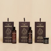
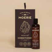
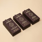
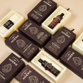
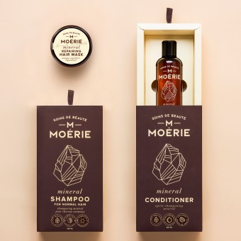
| DESIGN NAME: Moerie PRIMARY FUNCTION: Beauty Care Products INSPIRATION: Moerie product line contains overall feeling of naturalness, luxury and unique composition. Creating packaging concept for this product carried us away 100 years into the past inside a small Provence pharmacy where everything is carefully mixed and iconic brown glass medical bottles filled with all natural contents find itself in customer hands. As well as natural past, splendour of modern day fashion industry also was great influence creating this concept. UNIQUE PROPERTIES / PROJECT DESCRIPTION: Only what matters the most is the main idea of this design. All the superfluous elements were eliminated leaving only parts that customer cares about. A lot of attention payed to materials, printing technologies and quality while graphic contents minimized. Brown glass and stiff brown plastic bottles were selected as primary packaging. All the necessary information is screen printed in yellow. Brown and yellow are the main colors of the brand that conveys message about natural, historic and earthy product. Finally, everything is put together in secondary packaging box with a drawer to maintain luxury feel and add emotional value. OPERATION / FLOW / INTERACTION: Removing boundaries between uniqueness and purpose was main point executing this project. Easy to use dispensers were used with shampoo and conditioner bottles, which allows consumer to use the product without unscrewing the cap. Jar of hair mask was made to be as wide as possible for easy to use experience. Luxury drawer box not only created additional emotional value but served perfectly as a gift box. PROJECT DURATION AND LOCATION: This project started in October 2016 and finished in November 2016, Lithuania. FITS BEST INTO CATEGORY: Packaging Design |
PRODUCTION / REALIZATION TECHNOLOGY: Pet bottles and glass jar was decorated by silk printing technology. We created unique dieline for a secondary packaging which was made from cardboard, printed in 2 pantones, covered with Soft Touch laminate and UV coating. SPECIFICATIONS / TECHNICAL PROPERTIES: Silk Printing on bottles and glass jar. Bottles – diameter: 48 mm, height: 180 mm. Jar – diameter: 58 mm, height: 64 mm Offset printing and UV printing. Cardboard box – 120 mm x 235 mm x 65 mm TAGS: Vintage, Modern, Luxury, Fashion, Beauty care, Moerie RESEARCH ABSTRACT: Analyzing beauty care product market two main segments were noticed. Small hand made cosmetics producers and huge corporations are those who stands out. After researching benefits and drawbacks of above-mentioned categories we took what is best and combined it into one product concept. Another challenge was creating sturdy packaging that would be strong enough to withstand heavy products. In this stage paper and printing specialists were a huge help achieving desirable results. CHALLENGE: One of the biggest challenges was to join in many ways different qualities like naturalness, luxury and fashion. After executing deep research we came up with perfect solution selecting natural colors, historic style and modern format. Another problem solved – conveying product assets and not overcrowding the packaging. ADDED DATE: 2017-03-17 01:04:02 TEAM MEMBERS (3) : Creative Director: Motiejus Gaigalas, Graphic Designer: Motiejus Gaigalas and Copywriter: Radvile Linksmuole IMAGE CREDITS: Marius Zicius |
||||
| Visit the following page to learn more: http://www.moontroops.com | |||||
| AWARD DETAILS | |
 |
Moerie Beauty Care Products by Moon Troops is Winner in Packaging Design Category, 2016 - 2017.· Press Members: Login or Register to request an exclusive interview with Moon Troops . · Click here to register inorder to view the profile and other works by Moon Troops . |
| SOCIAL |
| + Add to Likes / Favorites | Send to My Email | Comment | Testimonials | View Press-Release | Press Kit |

