The Theodore Website by Enrico Pieri |
Home > Winners > #56718 |
 |
|
||||
| DESIGN DETAILS | |||||
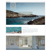
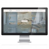
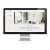
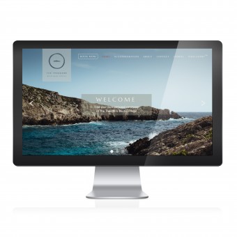
| DESIGN NAME: The Theodore PRIMARY FUNCTION: Website INSPIRATION: Inspiration behind this website design was to be empathetic to the brand identity which I designed as well. Inspired by the Greek letter theta the island in the 'centre' surrounded by the circle represented a place of sanctuary. This was emulated in the use of white space and clear layout, minimalistic approach and hierarchy. Colour palette was inspired by the classical Cretan painting of the Minoan Bull, where the hotel was built, and imagery was used to imitate the aforementioned features. UNIQUE PROPERTIES / PROJECT DESCRIPTION: The Theodore website is the hub and home for the online presence of The Theodore Boutique Hotel. It differs from other commercially advertised and boutique hotels by its translation of design from its original identity. Shocking use of imagery, minimalistic approach and unique colour palette are all part of what sets the Theodore apart. As well as this the clean UI coupled with the easily navigated UX ensure a pleasurable experience for the consumer when looking to book a holiday. OPERATION / FLOW / INTERACTION: A multiple page website, with clear navigation and text layout to provide a seamless user experience. PROJECT DURATION AND LOCATION: The website along with the hotel we're opened and launched during July 2016. |
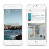
PRODUCTION / REALIZATION TECHNOLOGY: The process of the website began with conceptual designs for the identity. Research files were created in support of all conceptual assets. Once completed thorough print and digital guidelines were created to ensure brand consistency in the web design. Wireframes were the start of the design process, this enabled a holistic look at how the UX would integrate with the UI. From then on I began to develop the design to a point where it worked in harmony with the brand identity. SPECIFICATIONS / TECHNICAL PROPERTIES: The site was given a fully responsive design to work well over multiple screen sizes, tablets and devices. TAGS: website, design, branding, responsive, logo, UI RESEARCH ABSTRACT: Research for the website design was wide ranged. The theta symbol was chosen as the circle represented the sun god Apollo and what he stood for as a Greek God: healing, sun, light. We then used the island outline which replaced the bar in the centre of the circle. This provided the concept for 'sanctuary' CHALLENGE: The hardest part of this project was creating something that spoke to both locals of the island and new-comers while still retaining a similar effect on all who viewed the site. Staying true to the Greek routes yet not seeming like a cliche. ADDED DATE: 2017-03-13 14:00:08 TEAM MEMBERS (1) : Enrico Pieri IMAGE CREDITS: Enrico Pieri, 2016. PATENTS/COPYRIGHTS: Copyright of Enrico Pieri Designs, 2017 |
||||
| Visit the following page to learn more: http://enricopieri.com/ | |||||
| AWARD DETAILS | |
 |
The Theodore Website by Enrico Pieri is Winner in Website and Web Design Category, 2016 - 2017.· Press Members: Login or Register to request an exclusive interview with Enrico Pieri. · Click here to register inorder to view the profile and other works by Enrico Pieri. |
| SOCIAL |
| + Add to Likes / Favorites | Send to My Email | Comment | Testimonials | View Press-Release | Press Kit |

