Antalis Calendar by Izabela Jurczyk & Małgorzata Boszulak |
Home > Winners > #56658 |
 |
|
||||
| DESIGN DETAILS | |||||
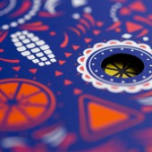
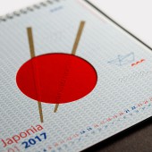
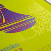
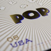
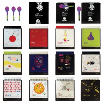
| DESIGN NAME: Antalis PRIMARY FUNCTION: Calendar INSPIRATION: The calendar, Tastes of the World, has been divided into 4 geographical areas Asia, Africa, America, Europe. The desktop calendar takes us on an exquisite culinary paper journey. The project shows a wide range of possibilities for combining paper from different categories. The properly used graphic design emphasises colour, texture or finishing of the presented material. UNIQUE PROPERTIES / PROJECT DESCRIPTION: The culinary paper journey begins with the Rives Tradition Black cover. A spoon designed as a bookmark, made of printed paper combined with magnetic foil, will help us recognise flavours. The presented graphic concept relates directly to flavours of the world in the culinary, cultural and geographical context. Depending on the region of the world in which we find ourselves, we will experience different tastes and our perception will be different. Nothing unites us more than a meal. Using a unique material which paper is, we start a fascinating journey around the world. OPERATION / FLOW / INTERACTION: The graphic presented in the calendar relates directly to the international social dialogue made through the presentation of cultures and tastes. Meeting together at a table, using a unique material which paper is, we begin a fascinating journey around the world. Paper becomes a tool to learn about and to open to new cultures. PROJECT DURATION AND LOCATION: The project started in July 2016 and finished in December 2016. Lodz and Warshaw FITS BEST INTO CATEGORY: Graphics, Illustration and Visual Communication Design |
PRODUCTION / REALIZATION TECHNOLOGY: hot foil stamping, blind stamping, punching, laser, a variety of printing techniques: combining offset printing with screen printing, printing with the use of properly selected pantone colours, UV coating, digital printing SPECIFICATIONS / TECHNICAL PROPERTIES: stand - 210 x 230mm, binding - spiral, volume - 12 pages and cover, format of the 13 cards - 190 x 200mm TAGS: Calendar, desktop calendar, pages, printing, screen printing, offset, paper, decorative, unique, treatment, pressing, cutting RESEARCH ABSTRACT: Meeting the customers' expectations, we present a wide range of colors through appropriately used graphic design and some refinement techniques. The following pages of the calendar are arranged in the way to tell a story. Some of them have common elements, for example STYCZEN, LUTY. Common elements of both pages are chopsticks and red color too. CHALLENGE: The challenge we had to face was to work out an interesting, outstanding and original concept featuring a wide offer of decorative papers and synthetic materials, creating graphics emphasizing the advantages of the selected printing ground, showing the difference between plain and textural finishing of this ground. To achieve this goal we chose the theme of dishes characteristic of specific cultures. ADDED DATE: 2017-03-09 14:54:19 TEAM MEMBERS (3) : Studio Design, Izabela Jurczyk and Gosia Boszulak IMAGE CREDITS: Image #1: Photographer Robert Bobryk Image #2: Photographer Robert Bobryk Image #3: Photographer Robert Bobryk Image #4: Photographer Robert Bobryk Image #5: Photographer Robert Bobryk Video: Creator Robert Bobryk PDF: Creator Robert Bobryk PATENTS/COPYRIGHTS: STUDIO DESIGN |
||||
| Visit the following page to learn more: http://bit.ly/2mmILZu | |||||
| CLIENT/STUDIO/BRAND DETAILS | |
 |
NAME: Antalis Poland Sp z o.o. PROFILE: The world leading distributor of paper, packaging solutions and visual communication products for professionals. |
| AWARD DETAILS | |
 |
Antalis Calendar by Izabela Jurczyk & Małgorzata Boszulak is Winner in Graphics, Illustration and Visual Communication Design Category, 2016 - 2017.· Press Members: Login or Register to request an exclusive interview with Izabela Jurczyk & Małgorzata Boszulak. · Click here to register inorder to view the profile and other works by Izabela Jurczyk & Małgorzata Boszulak. |
| SOCIAL |
| + Add to Likes / Favorites | Send to My Email | Comment | Testimonials | View Press-Release | Press Kit |

