DESIGN NAME:
LaPuro
PRIMARY FUNCTION:
Medical Beauty Centre
INSPIRATION:
Using design to medical beauty enterprises to reshape a new image,
business expansion, to attract more high-end clients. Features space shows rigid and soft furnishings. Design combines classical architecture and top technology. Elegant lines with lighting effects to create 'energetic and graceful are together'. Highlight the 'health and beauty' of brand personality. Center equipment and attendants improve high-quality service. Bring higher credibility and better reputation by spatial branding and design.
UNIQUE PROPERTIES / PROJECT DESCRIPTION:
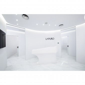
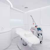
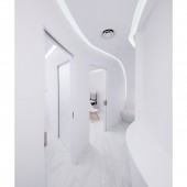
LaPuro is a medical beauty centre. The brand name comes from French words, La Puro, means the pure, clear and limpid. The visual identity and spatial planning are inspirited from Milk and Honey as the main colour of the centre is pure white and the space is applied Ogee curve in aesthetic. Milk represent to life and beauty, such as medical beauty that provide healthcare and beauty. The wave and movement of honey present the shape and form in space planning. As the ceiling features are designed in great aesthetic solutions to the interior space and integrated lighting effect to create an atmosphere fully in caring and simply aesthetic.
OPERATION / FLOW / INTERACTION:
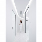
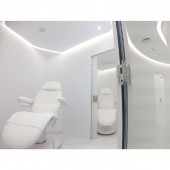
This is a multiple task circulation spatial where can take care each party (doctor, medical team, client, accompany). Doctor and client have their own position and privacy. After the treatment, they can leave the rooms by different openings without any connections. Medical team is their bridge who take care the client and support the doctor as they need to access through the whole space. Special seat for accompany with a mini bar that can serve themselves freely at the end of corridor. In sense, the space is interacted with different parties, but they have their own operation.
PROJECT DURATION AND LOCATION:
LaPuro is located in Sheung Wan. The project started in October 2016 and finished in December 2016. The Medical Beauty Centre started in operation in January 2017.
FITS BEST INTO CATEGORY:
Interior Space and Exhibition Design
|
PRODUCTION / REALIZATION TECHNOLOGY:
The main concern of material selection is to balance both aesthetic and hygiene. The flooring is applied clear white marble. The wall is painted with pure white hygienic paint and shaped smoothly without uneven surface which present fancy feeling and easy to keep cleaning by the user. Also, we encourage to use sustainability and environmental materials in our project. The reception desk is designed in slope surface which can suitable for different height of users.
SPECIFICATIONS / TECHNICAL PROPERTIES:
Design area: 93 square meters
TAGS:
#medical, #beautycentre, #clinic, #lapuro, #healthcare, #design, #interior, #nowhere, #hospital, #smartoffice, #white, #purespace, #streamline, #flowing
RESEARCH ABSTRACT:
Before Starting to plan the spatial, we studied the process and operation of medical beauty centre. We need to understand the needs of doctors and clients. Therefore, we applied the user experience into the spatial planning that can provide great space environment to user. Comment from the owner, "My clients told me that they felt comfortable and relax in this designed environment. They feel situated in a centre where the operator or the doctor knows what they want to achieve." And the doctor said: "We do body sculpting also and clients feel the themes of aestheics and slim."
CHALLENGE:
As usual, clients feel nervous and anxiety to stay in medical beauty centre for waiting their surgery and treatment. However, the reception is created with surrounded atmosphere that wish to give clients a hug and feel relieved. For clients' privacy and respect, applying zone planning to organize each process. From preparation, operation to treatment, there are access to connect each room without walk through the reception and corridor which clients don't have any embarrass time or bad feeling during the whole process. With a limited space area, using curved partition to divide the space wider visually.
ADDED DATE:
2017-03-06 03:32:27
TEAM MEMBERS (2) :
Design Director: Tony Lau Chi-Hoi and Design Manager: Kathy Lam Ka Yi
IMAGE CREDITS:
Tony Lau Chi-Hoi and Kathy Lam Ka Yi, 2016.
PATENTS/COPYRIGHTS:
Copyrights belong to NowHere® Design Limited, 2016.
|
