San Francisco Ballet Digital Transformation by Method Inc |
Home > Winners > #56280 |
 |
|
||||
| DESIGN DETAILS | |||||
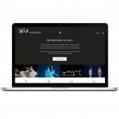
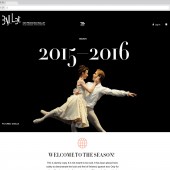
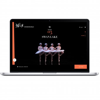
| DESIGN NAME: San Francisco Ballet PRIMARY FUNCTION: Digital Transformation INSPIRATION: Method’s work for San Francisco Ballet is one of the first projects that aims to expand participation through the innovative design of their new web experience.We were asked to redesign San Francisco Ballet’s online presence to illuminate the organization’s heritage and story, provide a richer informational and transactional experience, bring broader awareness and appreciation to the art form, and inspire audiences through dance. UNIQUE PROPERTIES / PROJECT DESCRIPTION: Method partnered with San Francisco Ballet to design a new digital platform that facilitates engagement to its audience through multiple touch points with the intention to clarify the company’s story, provide inspiration through dance and attract a broader audience through education. The new online experience gives audiences the freedom to explore and appreciate the ballet through multiple lenses, while extending the same elegance you would find in a performance to some of the more focused tasks such as ticket purchase or donation. OPERATION / FLOW / INTERACTION: The new online experience provides the SF Ballet with an outlet to communicate their story and inspire audiences to interact with the company through different touch points. The website offers users an extremely easy to use platform that they can navigate easily and quickly accomplish different actions. One of the goals in creating this website was to create something that would grow alongside the company. The new focus on storytelling and the modularity of the site will allow them to grow and evolve the story of SF Ballet over time PROJECT DURATION AND LOCATION: The project lasted for 13 weeks and the website launched September 21st, 2016. |
PRODUCTION / REALIZATION TECHNOLOGY: Education and storytelling served as the primary drivers, laying the groundwork for the project, couched in the “changing season” as the overarching design theme. Due to Ballet’s repertory, off, and holiday seasons, Method approached the design to flexibly adapt to the features of each distinct time period. The navigation stems from the content of each page instead of an actual navigational dropdown menu, enabling related content to live amidst the pages, while providing quick access to other sections within the site. SPECIFICATIONS / TECHNICAL PROPERTIES: - TAGS: Web design, Digital Transformation, New Online Experience, Content Strategy, Internal Alignment RESEARCH ABSTRACT: Throughout the process of the project, the team focused on driving the potential of the interaction model, service layer and design system to enhance storytelling and connections to San Francisco Ballet’s diverse audience. Though the performing arts space can be antiquated, San Francisco Ballet is more progressive than most. Still, they wanted their site to not only be innovative, but cutting-edge. The team accomplished this through a responsive, relevant, forward-looking digital experience that provides a direct path to the art form of dance. CHALLENGE: Traditionally, the arts are a patron-based world—largely comprised of a more mature, affluent audience. The push to diversify and reach new groups has grown considerably, and what started as an opportunity has become a necessity: engaging the next generation of dance enthusiasts and donors by providing a coherent experience across touchpoints. ADDED DATE: 2017-03-01 19:37:15 TEAM MEMBERS (6) : Brennan Wozencroft, Athila Armstrong, Shivanjali Tomar, Adriana Fracchia , Kaisha Hom and Shelby Lindblad IMAGE CREDITS: Method Inc, 2016. |
||||
| Visit the following page to learn more: http://www.method.com/work/sfballet | |||||
| AWARD DETAILS | |
 |
San Francisco Ballet Digital Transformation by Method Inc is Winner in Website and Web Design Category, 2016 - 2017.· Press Members: Login or Register to request an exclusive interview with Method Inc. · Click here to register inorder to view the profile and other works by Method Inc. |
| SOCIAL |
| + Add to Likes / Favorites | Send to My Email | Comment | Testimonials | View Press-Release | Press Kit |


