JS Tallman Bourbon Packaging by Kristin Casaletto - Sasquatch |
Home > Winners > #56129 |
 |
|
||||
| DESIGN DETAILS | |||||
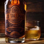
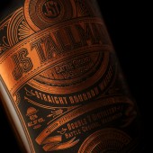
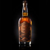
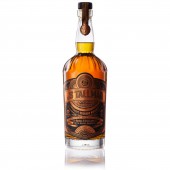
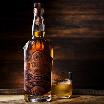
| DESIGN NAME: JS Tallman Bourbon PRIMARY FUNCTION: Packaging INSPIRATION: The tall copper stills in the Double V Distillery and the amber color of the bourbon were inspiration for creating a bottle label made entirely from copper foil on matte black paper. The blind emboss and detailed design work was inspired by the detail and care that went in to the creation of this spirit. UNIQUE PROPERTIES / PROJECT DESCRIPTION: JS Tallman Bourbon Whiskey was made entirely from scratch in Battle Ground, Washington by Double V Distillery, using local ingredients. The name of the bourbon, JS Tallman, is an allusion to the family tree of the distillery. It combines the initials of the two brothers, John and Steve, who started the distillery in 2009. The label pays homage to this story and to the distillers’ passion for detail. Copper foil and blind emboss on matte black paper form a bold, dramatic presence. Each bottle is hand signed and closed with a decorative necker that bares the family crest. OPERATION / FLOW / INTERACTION: When creating the label for JS Tallman Bourbon, it was especially important to create a pleasant and memorable experience for the user. When picking up the bottle, the tapered glass fits nicely in your hand. If you run your fingers over the paper label, there's a slight texture to the paper that gives it added beauty. The emboss and blind emboss on the label also creates a wonderful tactile experience that enhances the appearance of the copper foil and the perceived quality of the product. PROJECT DURATION AND LOCATION: This project started in April 6, 2015 and was completed on October 12, 2016 in Portland, Oregon, USA. It is sold locally throughout the state of Washington. FITS BEST INTO CATEGORY: Packaging Design |
PRODUCTION / REALIZATION TECHNOLOGY: Just like the hand-crafted bourbon in the bottle, the label design details were made entirely from scratch, by hand, and crafted to perfectly fit the bottle and highlight the care and attention paid to creating Double V Distillery's signature spirit. Drawing inspiration from the massive copper stills in their distillery, we chose to create the label entirely from copper foils on a matte black surface that would contrast well with the shiny material. SPECIFICATIONS / TECHNICAL PROPERTIES: The final dimensions of the front label design is 120 mm x 130 mm. The back label is 76 mm x 114 mm, and the top closure sticker is 25 mm x 164 mm. TAGS: foil, packaging, design, alcohol, beverage, copper, stills, bourbon, labels RESEARCH ABSTRACT: When starting this project, our research consisted of looking at competitor packaging in the Pacific Northwest region of the United States. We wanted to create a package that would stand out amongst the crowded shelves of bourbon and create excitement for the buyer. CHALLENGE: JS Tallman is the inaugural bourbon from Double V Distillery. Meticulously crafted and patiently aged, the bourbon was made entirely from scratch in Battle Ground, Washington using local ingredients. The name JS Tallman is an allusion to the family tree of the distillery. Sasquatch was tasked with communicating this story, while also creating a brand that would stand apart from the plethora of new-to-market brown craft liquors flooding the market. ADDED DATE: 2017-02-28 22:34:09 TEAM MEMBERS (2) : Kristin Casaletto and Ben Jenkins IMAGE CREDITS: All photography by Steve Cherry, Polara Studio, Portland, Oregon, USA |
||||
| Visit the following page to learn more: http://sasquatchagency.com | |||||
| AWARD DETAILS | |
 |
Js Tallman Bourbon Packaging by Kristin Casaletto-Sasquatch is Winner in Packaging Design Category, 2016 - 2017.· Read the interview with designer Kristin Casaletto - Sasquatch for design JS Tallman Bourbon here.· Press Members: Login or Register to request an exclusive interview with Kristin Casaletto - Sasquatch. · Click here to register inorder to view the profile and other works by Kristin Casaletto - Sasquatch. |
| SOCIAL |
| + Add to Likes / Favorites | Send to My Email | Comment | Testimonials | View Press-Release | Press Kit |
Did you like Kristin Casaletto-Sasquatch's Packaging Design?
You will most likely enjoy other award winning packaging design as well.
Click here to view more Award Winning Packaging Design.


