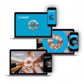
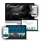
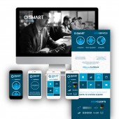
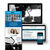
Smart Consulting Fully responsive webdesign by Joana Júdice |
Home > Winners > #55501 |
 |
|
||||
| DESIGN DETAILS | |||||
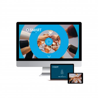
| DESIGN NAME: Smart Consulting PRIMARY FUNCTION: Fully responsive webdesign INSPIRATION: Smart Consulting is a IT Consultancy delivering services all over the world. Our main goal is to be recognized as the best consultancy in this field... How can we do that due to all the competition in the market? Being SMART! The brand identity and webdesign was inspired and based in this idea of Be Diferent, Act Diferently, Think Outside the Box! Smart is The New Sexy! And it can be very very FUN too! UNIQUE PROPERTIES / PROJECT DESCRIPTION: This website had a lot of information to include so my main concern was to focus the design in illustrations to simplify. The website is very minimalist and clean, all the atention goes to the container. The menu is integrated in our logo for three main reasons: - I didn’t want too many information at the same time; - I want people people to listen to our story by scrolling down; - Our story is revealed by us so the menu comes from inside our brand. This is a Smart Website. There is no extras! OPERATION / FLOW / INTERACTION: 3S’s: Simple, Smart and Special. As any Story Telling should be. The whole story is delivered in the home page. If the user decides to go to through the menu to each section, every single page has a story and makes sure you won’t miss the whole concept and feeling. There is diferent galleries in each page or one video in its place. Moments and the people are always there. PROJECT DURATION AND LOCATION: Started in January 2017 in Lisbon, Portugal. Presented on February 2017. |
PRODUCTION / REALIZATION TECHNOLOGY: The webdesign and the visuals were originaly made with Illustrator and Photoshop. The development was based in Wordpress platform, using the Corpress Template for the flow and wireframming wich was after adapted to meet out design. We use HTML/CSS/JS to prototyping. SPECIFICATIONS / TECHNICAL PROPERTIES: Fully responsive webdesign. Mobile, tablet and desktop. Retina ready. TAGS: smart, IT, recuitment, lisbon, portugal, nearshoring, outsourcing, smartconsulting RESEARCH ABSTRACT: The user experience and interaction played an important role in the simple and minimalist design. The information architecture was thought to tell a story and interact in a SMART/ funny way with the user as if there is actually a person talking to you and showing the company. How the video shows up from inside our logo, how the illustrations transform together with the parallax technology, the interaction between the call actions, the maps, videos and information. Everything is conected and you don’t need to search for the information because everything is very clear and clean. You just have to enjoy the Story! CHALLENGE: The challenge was to find smart ways to talk about so serious subjects. And to be abble to interact with an usual user and a very experienced develloper at the same time. How could we do it? For the users we design, better, for developers we devellop smarter. So there are inside messages in the code to comunicate directly with this audience. And everything is very simplified by images, photos, videos and illiustrations for the common users. ADDED DATE: 2017-02-27 11:47:44 TEAM MEMBERS (1) : Creative Director/Designer/Photographer & Video Director: Joana Júdice IMAGE CREDITS: Smart Consulting - Delivering IT PATENTS/COPYRIGHTS: Smart Consulting - Delivering IT |
||||
| Visit the following page to learn more: http://www.smartconsulting.pt | |||||
| AWARD DETAILS | |
 |
Smart Consulting Fully Responsive Webdesign by Joana Júdice is Winner in Website and Web Design Category, 2016 - 2017.· Press Members: Login or Register to request an exclusive interview with Joana Júdice. · Click here to register inorder to view the profile and other works by Joana Júdice. |
| SOCIAL |
| + Add to Likes / Favorites | Send to My Email | Comment | Testimonials | View Press-Release | Press Kit |

