Kirin Natural Mineral Water Bottled water package by Kota Sagae |
Home > Winners > #54972 |
 |
|
||||
| DESIGN DETAILS | |||||
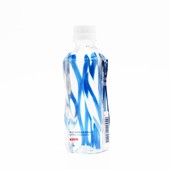
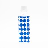
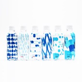
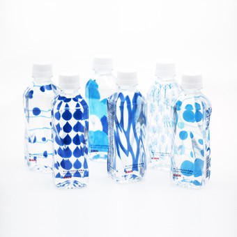
| DESIGN NAME: Kirin Natural Mineral Water PRIMARY FUNCTION: Bottled water package INSPIRATION: Recently, bottled water is consumed every day but heavy to carry. Because of that, many people buy bulk through the internet. However, in order to appeal to consumers, bottled packages often carry strong ad opinions and after purchase, did not harmonize with living space. So we designed the bottles, with the concept of packaging design creating the harmony with interior and fashion. UNIQUE PROPERTIES / PROJECT DESCRIPTION: This is a bottled water product sold only on an e-commerce site. Thirty bottles which have 6 different types of design are assorted in a box. We made the water itself the protagonist of the design. One side of the bottle has the small product title only, so that the patterns of the back are seen through the refraction of water. The patterns look differently according to the angle. Such effect increases the presence of natural water itself and the water looks more delicious through the bottle. OPERATION / FLOW / INTERACTION: Bottle design was popular and repeaters increased. Also, even after drinking water, it is just right size and cute design, Some people reuse bottles instead of water bottles. PROJECT DURATION AND LOCATION: This project began in Japan in October 2015, ended in February 2016, and goods were released around March 2016. FITS BEST INTO CATEGORY: Packaging Design |
PRODUCTION / REALIZATION TECHNOLOGY: I used transparent ink for printing and stuck to the transparent impression of the bottle. And, without using the white plate, even if only transparent ink, we verified repeatedly so that the pattern of 6 patterns could be clearly seen. SPECIFICATIONS / TECHNICAL PROPERTIES: 310ml = 10.48 fl oz. width 50mm x depth 50mm x height 170mm TAGS: bottle design, water packaging design, brand design, Kirin Yawaraka RESEARCH ABSTRACT: We studied inks so that the patterns of water and design adapt. We did trial and error so that design pattern clearly appears only with clear ink, without using white solid plate. CHALLENGE: We pursued how to make use of refraction of water. When I looked at the bottle from the front, I repeated the verification so that the design looks more beautiful through the water. ADDED DATE: 2017-02-25 12:56:42 TEAM MEMBERS (1) : Art Director / Designer : Kota Sagae IMAGE CREDITS: Kota Sagae, 2016. |
||||
| Visit the following page to learn more: http://sagainc.co.jp/ | |||||
| AWARD DETAILS | |
 |
Kirin Natural Mineral Water Bottled Water Package by Kota Sagae is Winner in Packaging Design Category, 2016 - 2017.· Press Members: Login or Register to request an exclusive interview with Kota Sagae. · Click here to register inorder to view the profile and other works by Kota Sagae. |
| SOCIAL |
| + Add to Likes / Favorites | Send to My Email | Comment | Testimonials | View Press-Release | Press Kit |


