DAILY BREADS Packaging design system by ELEPHANT DESIGN PVT LTD |
Home > Winners > #54491 |
 |
|
||||
| DESIGN DETAILS | |||||
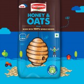
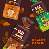
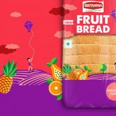
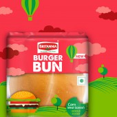
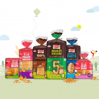
| DESIGN NAME: DAILY BREADS PRIMARY FUNCTION: Packaging design system INSPIRATION: We decided to infuse some emotion and uniqueness in the packaging to help it stand apart and create a strong impact on the consumers mind to help them make an informed decision and not through impulse. The inspiration was the changing lifestyle and attitude of the consumer. They lead a stressful lifestyle with bad food habits and are pressed for time. We needed to create stories that would connect with their need and at the same time be a delight as a purchase as an experience and on the shelf UNIQUE PROPERTIES / PROJECT DESCRIPTION: We devised a way to weave the product window with the story we were telling on that pack. This enabled us to make each variant become unique telling its own story yet maintaining an overall brand and pack visual language to bind the entire product portfolio together. The entire visual language was based on hand-drawn grungy and un engineered elements to create a sense of natural, earthy ingredients that aid a healthy lifestyle. Each product window in a simple yet effective way conveys the benefit OPERATION / FLOW / INTERACTION: Transparent poly PROJECT DURATION AND LOCATION: June 2015 to February 2016 Pune INDIA FITS BEST INTO CATEGORY: Packaging Design |
PRODUCTION / REALIZATION TECHNOLOGY: Deep brown as a colour was unseen of in the category that was dominated by whites, browns and blues. The deep earthy brown together with bright, vibrant colours made a fine combination for a delightful range of products. SPECIFICATIONS / TECHNICAL PROPERTIES: A big challenge was also getting the vibrant colours right on the substrate selected for the product. Since it is a transparent base, it was important to get the vibrancy of the colours right as that was key in creating the right impact. Through multiple iterations and print runs, our team got the best results and achieved the desired impact. TAGS: staple, packaging design, breads, health, family RESEARCH ABSTRACT: Our research highlighted that breads as a category is very functional and a staple that does not require much involvement during purchase in the Indian consumers mindset. Hence the category does not enjoy a lot of brand loyalty and is driven by availability and impulse. Britannia breads has a wide range of breads in various formats, types and geographies. They needed to be communicated to the consumer in an impactful and effortless way. CHALLENGE: The existing range of products was very disparate and did not look like a part of the same family. The biggest challenge was devising a visual language that would work across all formats of breads in the portfolio and yet be relevant individually. To rationalize the various products existing in different geographies at various price points with varying consumer needs that had to be communicated on the different products. A big challenge was also getting the vibrant colours right on the substrate selected for the product. Since it is a transparent base, it was important to get the vibrancy of the colours right as that was key in creating the right impact. ADDED DATE: 2017-02-23 07:19:36 TEAM MEMBERS (2) : Design Director: Mayuri Nikumbh and Account Manager: Mayank Banta IMAGE CREDITS: ELEPHANT DESIGN PVT LTD , 2016. |
||||
| Visit the following page to learn more: http://www.elephantdesign.com/ | |||||
| AWARD DETAILS | |
 |
Daily Breads Packaging Design System by Elephant Design Pvt Ltd is Winner in Packaging Design Category, 2016 - 2017.· Read the interview with designer ELEPHANT DESIGN PVT LTD for design DAILY BREADS here.· Press Members: Login or Register to request an exclusive interview with ELEPHANT DESIGN PVT LTD . · Click here to register inorder to view the profile and other works by ELEPHANT DESIGN PVT LTD . |
| SOCIAL |
| + Add to Likes / Favorites | Send to My Email | Comment | Testimonials | View Press-Release | Press Kit |
Did you like Elephant Design Pvt Ltd's Packaging Design?
You will most likely enjoy other award winning packaging design as well.
Click here to view more Award Winning Packaging Design.


