DESIGN NAME:
Tin Man Filling Station
PRIMARY FUNCTION:
Branding
INSPIRATION:
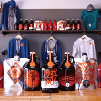
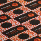
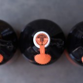
The logo was inspired by industrial design, the main feel of the place. Using visual elements that resemble gears, steel and a monogram to complement the complex and bold content, the logo captures the same attitude in the craft beer world. Each growler design tells a story that sometimes, only locals would understand.
UNIQUE PROPERTIES / PROJECT DESCRIPTION:
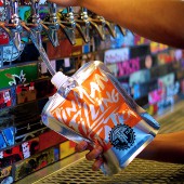
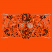
Logo, brand and merchandise are all inspired by the uniqueness of the region. A first of its kind in the region, Tin Man only sells regional (Texas) beer. Growlers designs change often to add value to the brand. Inspired by the uniqueness of the region and the industrial interior design, each detail of the brand was thought out. Included in the brand is a special edition army growler to honor Ft. Bliss, the Army's second-largest installation, behind the adjacent White Sands Missile Range.
OPERATION / FLOW / INTERACTION:
-
PROJECT DURATION AND LOCATION:
-
FITS BEST INTO CATEGORY:
Graphics, Illustration and Visual Communication Design
|
PRODUCTION / REALIZATION TECHNOLOGY:
-
SPECIFICATIONS / TECHNICAL PROPERTIES:
-
TAGS:
-
RESEARCH ABSTRACT:
-
CHALLENGE:
-
ADDED DATE:
2017-02-22 05:11:33
TEAM MEMBERS (1) :
IMAGE CREDITS:
EME Design Studio, 2016.
|


