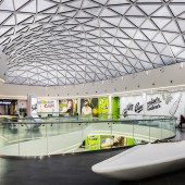
DESIGN NAME:
Horosho!
PRIMARY FUNCTION:
Shopping mall
INSPIRATION:
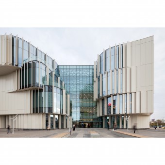
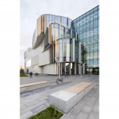
The design ideas were driven by the needs of the site. The surrounding buildings are non-heritage typical mass production housing of the 80s. We agreed not to follow any vernacular style, but having in mind the site restrictions, viewing axis and compositional issues tried to create a contrast, fresh and dynamic yet friendly volume that can start revitalization of the district. The facade is mainly perceived from car thus was driven by the idea of flow and dynamism in nature like wind, water.
UNIQUE PROPERTIES / PROJECT DESCRIPTION:
Main feature is functionality. No decisions were made out of notion of just beauty. Our goal for the design was to fulfill the needs of tenants, to be friendly to visitors and pedestrians, meet client’s needs, be economically sensible and fast in construction, to be respectful to surrounding buildings and site in general and yet to combine all of that in single expressive gesture. The design provides and maximizes public areas, sunlight, provides wide array of dynamic lighting media solutions.
OPERATION / FLOW / INTERACTION:
General solution of main entrance performs as continuation of exterior public plaza enabling the organic flow of people into the building. Despite the juxtaposition of the main entrance on the Northern side of the building, facade geometry provides sunlight to this area. Implementation of media screens on the facade helped to get rid of a large number of exterior advertising structures. Façade provides room for numerous lighting scenarios that can increase the flow of people into the building.
PROJECT DURATION AND LOCATION:
The competition for the project was won in 2013. Realization took place from 2014 to 2016. Horoshevskoe shosse, 27, Moscow, Russia.
FITS BEST INTO CATEGORY:
Architecture, Building and Structure Design
|
PRODUCTION / REALIZATION TECHNOLOGY:
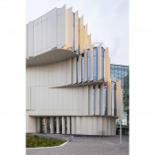
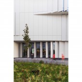
Facade panels are 6m high (height of one floor) are fixed in 2 parts (top and bottom) it is double sided material, so it provides both exterior and interior solution, this greatly reduces the construction time and is the most efficient solution.
If we take total facade area as 100%, then only 12% of non-typical elements are used, rest 88% of the facade are typical rectangular metal panels yet the design provides complex and rich geometry of the façade.
SPECIFICATIONS / TECHNICAL PROPERTIES:
Total building area - 114 130 m2
Underground parking area - 40 000 m2
Rentable area (GLA) - 49 140 m2
Number of floors above ground- 4
Number of floors underground- 2
Number of parking slots - 1176
TAGS:
Horosho!, shopping mall, iq studio, commercial architecture, bionic architecture, facade, Moscow, retail, metal, organic.
RESEARCH ABSTRACT:
1 Target group interviews - showed lack of public space, provided understanding of flow of people. Affected general planning scheme.
2 3d modeling and cad simulations, sun and artificial light studies - helped shaping volume for best natural lighting and other performances.
3 site visual axis analysis - helped shaping facade for best integration with city fabrics.
4 technical and structure analysis - enabled structure optimization for most efficient material use and visual lightness of structure.
CHALLENGE:
Challenges
1 this project was a result of competition that we won, so providing best solution among competitors in less than 2 weeks.
2 construction costs that were to be significantly reduced from the early stages of concept development through realization and still trying to retain all the ideas and concepts that were core to initial design.
3 retaining balance between clean architecture and strict requirements of tenants and marketing department wishing as much facade advertisement as possible.
ADDED DATE:
2017-02-18 16:29:42
TEAM MEMBERS (9) :
Erik Valeev, Sergei Nikolsky, Tatyana Lebedeva, Andrey Zdanov, Pavel Tutunnik, Maria Rubacheva, Julia Zulina, Zlata Timokhina and Victoria Stepanova
IMAGE CREDITS:
Image #1-5: Photographer Erik Valeev, Dmitry Chebanenko, 2016
|


