The Screeners Movie Review Blog by Liam Martens |
Home > Winners > #53427 |
 |
|
||||
| DESIGN DETAILS | |||||
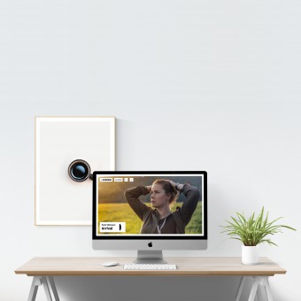
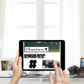
| DESIGN NAME: The Screeners PRIMARY FUNCTION: Movie Review Blog INSPIRATION: We, Jari and I, run this website as movie enthusiasts. We have always loved watching movies and decided to write about our experiences and to put that all together we decided I would create a website for it. We used to have a different design, but it has always been focused on images and simplicity. The reason for these decisions is simple. Movies are all about the images and a user comes on our website to read the review, nothing more. UNIQUE PROPERTIES / PROJECT DESCRIPTION: We have seen a lot of movie review websites but none of them really stood out to us and that's why we, as movie enthusiasts, took matter into our own hands. We wanted to create a simple and clean UI focused on the movies we review. We use big images to really get the users' attraction. We kept the homepage as clean as possible with minimal elements and this trend can be found throughout the site. OPERATION / FLOW / INTERACTION: Navigating the website is fairly simple. When you visit The Screeners you are first presented with our 5 most recent reviews, with the first one almost filling up your entire screen. From there you can either click a movie to read it, click all movies at the top to show all the reviewed movies, click the search icon to search for a genre or title and click the plus icon for more options. PROJECT DURATION AND LOCATION: The project started on 3 January 2016 and will continue. |
PRODUCTION / REALIZATION TECHNOLOGY: The front end on itself is pretty simple as it mostly just uses CSS and HTML. SPECIFICATIONS / TECHNICAL PROPERTIES: Since it is a website it is built responsively and should be able to adapt to almost any screen. TAGS: clean, simple, images, movies, white, icons RESEARCH ABSTRACT: We mostly looked at what other movie review websites were doing, what they were lacking and what we could improve upon. So we turned to RottenTomatoes where movie critics come together and checked out a whole bunch of critic websites. From the start it was pretty clear that most websites were slow, crowded, "ugly" or unusable and so our mission was clear. Create a simple, usable and clean movie review website. CHALLENGE: How do we add some personality to every single review without the need to design a completely different page for every movie as that would take way too much time. That was the biggest creative challenge, but I believe the solution that was implemented really pulled it off. The custom color scheme for every movie is easy to manage but adds a lot of personality to every review. ADDED DATE: 2017-02-13 15:24:05 TEAM MEMBERS (1) : IMAGE CREDITS: All images belong to the movie creators. |
||||
| Visit the following page to learn more: http://liammartens.com | |||||
| AWARD DETAILS | |
 |
The Screeners Movie Review Blog by Liam Martens is Winner in Website and Web Design Category, 2016 - 2017.· Press Members: Login or Register to request an exclusive interview with Liam Martens. · Click here to register inorder to view the profile and other works by Liam Martens. |
| SOCIAL |
| + Add to Likes / Favorites | Send to My Email | Comment | Testimonials | View Press-Release | Press Kit |


