Soul Spice Food Packaging by Chrish Knigge |
Home > Winners > #53260 |
 |
|
||||
| DESIGN DETAILS | |||||
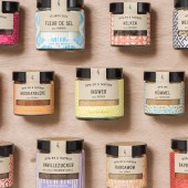
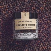
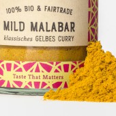
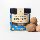
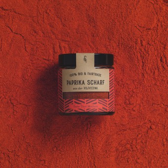
| DESIGN NAME: Soul Spice PRIMARY FUNCTION: Food Packaging INSPIRATION: Spices come from exotic parts of the globe, and they used to be valued as gold in ancient times. The aim was for the design to reflect the place of origin of the spices (with patterns reminiscent of Indian, African and Moroccan art) and their precious value. A further inspiration was the hand-crafted and sustainable philosophy of SoulSpice which needed to be reflected in the design. The SoulSpice design with its strong colors focuses on the joy of good food, sharing and living with responsibility – in line with the brand’s motto: Taste That Matters. UNIQUE PROPERTIES / PROJECT DESCRIPTION: In contrast to traditional spice brands, Studio Grau created a packaging design with a premium feel for SoulSpice that reflects the spices´ inherent value and colorfulness, while highlighting the brand´s sustainable and organic approach. Every spice therefore has a unique pattern, which is hand drawn, with a natural tone on the title section which maintains the range harmonious. As spices are light-sensitive, the packaging needed to provide protection while revealing enough of content to ensure the quality of the product could be immediately visible to the consumer. OPERATION / FLOW / INTERACTION: The label for the packaging is made in one piece. Just under the lid there is a perforation line, to ensure that when the glass is unscrewed, it makes a clean cut and stays beautiful. PROJECT DURATION AND LOCATION: The project for developing the brand packaging started in May 2016 and was finished and launched in Nov 2016 FITS BEST INTO CATEGORY: Food, Beverage and Culinary Arts Design |
PRODUCTION / REALIZATION TECHNOLOGY: There was an extensive development phase in which each of the patterns was drawn by hand and different layout approaches were tested. Mock-Ups of the packaging were created in Illustrator. Studio Grau aimed for precious looking glass containers to reflect again the valuable nature of the spices. Once the perfect glass containers were selected, the labels were printed out and the first prototypes were created. SPECIFICATIONS / TECHNICAL PROPERTIES: The glasses come in two sizes: Small: 60 ml , 52mm x 55mm x 52mm Large: 120ml, 61mm x 63mm x 61mm TAGS: packaging, food, pattern, spice, label RESEARCH ABSTRACT: Studio Grau started off with a two-day workshop at the Sonnenhof – the spice manufacturing plant in South Germany. It is a 500-year-old farmhouse with a long tradition. The owners look back on 15 years of project work with farmers in Asia and Africa and are well-known for their sustainable meat production. It was important to understand the core value of the new brand and balance out all views and wishes the makers had for their new spice brand. Studio Grau hung up about 200 different pictures symbolizing different values, the significance behind each picture was solely known to Studio Grau. Through a process of marking the pictures and talking about what they represented to the participants, Studio Grau created a chart of values and started to highlight those which had been named on several instances. Through this method they identified the key values that should be represented in the packaging. In the workshop Studio Grau prepared the ground for the brand's name and claim. Through a mind mapping exercise with post-its, while always keeping an eye on the core values, possible names were developed and resulted in the brand's motto: Taste That Matters. Studio Grau then went through an in-depth analysis of all the data from the workshop and boiling it down to key factors they wanted to work with. During the following 2 months, Studio Grau created drafts and worked on the different layouts. The ideas were then presented with prototypes in a beautiful packaging, and from there further development started on these real objects. The prototypes were tested with different audiences, going from modern young Berliners to classic older people in the countryside. After this evaluation phase, adjustments to the typography and coloring were made to finalize the product. CHALLENGE: As the spice producers had such a long history and tradition, it was very important to them that the stories of the farmers and the way they grow their spices are in spotlight, which seemed sometimes more important than the product itself. It was challenging to balance out the heavy history and content behind the brand and the spice itself. ADDED DATE: 2017-02-08 16:53:06 TEAM MEMBERS (2) : Artdirection: Chrish Knigge and Designer: Hannes Häfner IMAGE CREDITS: Studio Grau |
||||
| Visit the following page to learn more: https://studiograu.de/soulspice/?preview |
|||||
| AWARD DETAILS | |
 |
Soul Spice Food Packaging by Chrish Knigge is Winner in Food, Beverage and Culinary Arts Design Category, 2016 - 2017.· Read the interview with designer Chrish Knigge for design Soul Spice here.· Press Members: Login or Register to request an exclusive interview with Chrish Knigge. · Click here to register inorder to view the profile and other works by Chrish Knigge. |
| SOCIAL |
| + Add to Likes / Favorites | Send to My Email | Comment | Testimonials | View Press-Release | Press Kit |
Did you like Chrish Knigge's Culinary Art Design?
You will most likely enjoy other award winning culinary art design as well.
Click here to view more Award Winning Culinary Art Design.


