Festival Over de Vloed website Website by RTRN Branding and Activation |
Home > Winners > #53133 |
 |
|
||||
| DESIGN DETAILS | |||||
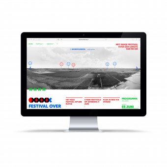
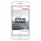
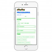
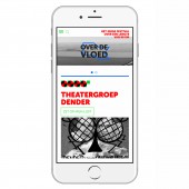
| DESIGN NAME: Festival Over de Vloed website PRIMARY FUNCTION: Website INSPIRATION: The festival takes place on and directly behind the seawall. Hence maritime design; think of signal flags fluttering in the wind. The color palette comes directly from the Groningen province flag: red, green and blue. Regional pride and supraregional allure. UNIQUE PROPERTIES / PROJECT DESCRIPTION: The website promotes Over de Vloed, a festival stretching along the Dutch Wadden Sea coast. The website scrolls along the 90 kilometers of UNESCO World Heritage Wadden Sea coastline, highlighting festival participants and events alike. OPERATION / FLOW / INTERACTION: Participants and events are plotted in a panoramic photograph of the festival area, stitching 90 kilometers of coastline together, and allowing end-users to interact with the website program by clicking the highlighted events. One can add events to a personal timetable which can be altered at any time, saved and shared. PROJECT DURATION AND LOCATION: The project started in Februari 2016 and ended at the Festival's completion in June 2016. |
PRODUCTION / REALIZATION TECHNOLOGY: Wordpress, HTML5, CSS, javascript SPECIFICATIONS / TECHNICAL PROPERTIES: desktop viewport 1440 x 900 px ipad landscape viewport 1024 x 728 px ipad portrait viewport 728 x 964 px mobile portrait viewport 360 x 580 px mobile landscape viewport 640 x 318 px TAGS: website, UX, UI, design RESEARCH ABSTRACT: To empathize with the festival's initiators the first step was a collective brainstorm which delivered a program, profiles of both participants and vistors, and input for the identity and designs. Next, empirical research showed festival visitors' propensity for an online interactive program. Usability is key, so we then researched solutions to fit the festival's extensive program in a wide-spread area into a website. This lead to a vertical scroll along 90 kilometers of coastline, bringing on the final challenge: to photograph the area. In the end we chose to segment the coastline and use drone photography to make the wide-angle pan shots which we stitched together to create the single vertical scroll enabling us to plot participants and events alike. To make it the vistors' go-to website before and during the festival, we designed the CMS to cross-reference dates, time and location so that end-users were able to personalize their festival program. CHALLENGE: stitching 90 kilometers of coastline photography together to one scrollable interface ADDED DATE: 2017-02-05 16:35:06 TEAM MEMBERS (2) : Design: Erik Dob and Design: Bart Bleeker IMAGE CREDITS: Photographer Vincent Lublink |
||||
| Visit the following page to learn more: http://www.rtrn.nl/portfolio/festival-ov |
|||||
| AWARD DETAILS | |
 |
Festival Over De Vloed Website Website by Rtrn Branding and Activation is Winner in Website and Web Design Category, 2016 - 2017.· Read the interview with designer RTRN Branding and Activation for design Festival Over de Vloed website here.· Press Members: Login or Register to request an exclusive interview with RTRN Branding and Activation. · Click here to register inorder to view the profile and other works by RTRN Branding and Activation. |
| SOCIAL |
| + Add to Likes / Favorites | Send to My Email | Comment | Testimonials | View Press-Release | Press Kit |
Did you like Rtrn Branding and Activation's Web Design?
You will most likely enjoy other award winning web design as well.
Click here to view more Award Winning Web Design.


