|
|
|

|
|
| DESIGN DETAILS |
DESIGN NAME:
HITACHI airy
PRIMARY FUNCTION:
Pamphlet
INSPIRATION:
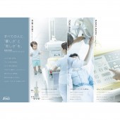
・For people’s understanding, it is often said that it is better to put things in three groups. Decided to use this fact for the creation of our brochure.
・Had an idea of categorizing airy’s excellence into three groups for quick understanding by using memetic words in Japanese to evoke instantaneous understanding of its excellence.
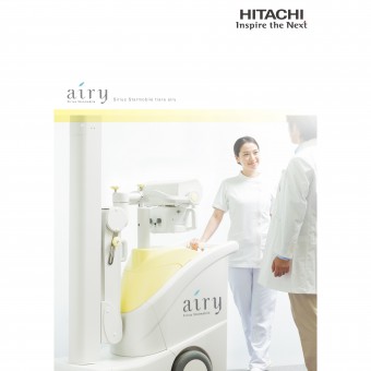
・Also decided to use images of an operator using airy as icon for each category to show the system’s advantages visually.
UNIQUE PROPERTIES / PROJECT DESCRIPTION:
・airy is Hitachi’s mobile X-Ray system and developed to be a reliable partner for female operators to provide strong support.
・The brochure is created to communicate how excellent airy is as a partner for female operators briefly.
・Created a friendly atmosphere by using soft pastel colors to make female operators feel easy to take a look at.
OPERATION / FLOW / INTERACTION:
・This pamphlet is to be used by sales reps when visiting hospitals and clinics to explain the product to medical and technical staff members.
PROJECT DURATION AND LOCATION:
・This pamphlet has been in use since April 2016.
FITS BEST INTO CATEGORY:
Graphics, Illustration and Visual Communication Design
|
PRODUCTION / REALIZATION TECHNOLOGY:
・Categorizing information into three groups and using memetic words helped to communicate airy’s excellence at a glance.
・Used images of an operator using airy as icon for each category as supplementary visual support to show airy’s advantages.
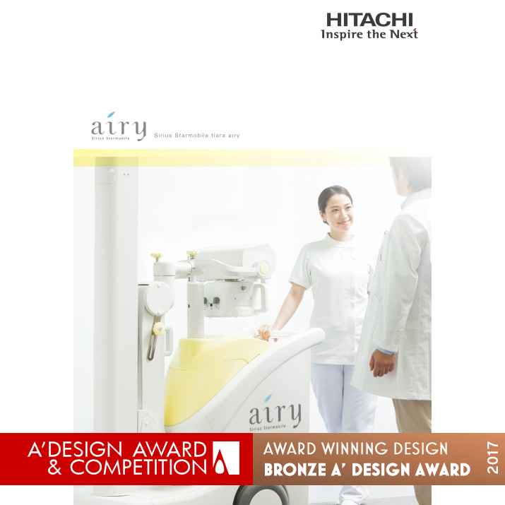
・Considered the model’s facial expression and color combination to make the brochure approachable for females.
・All of equipment body images are created by 3DCG but the beauty and high-quality feeling of the body are perfectly reproduced by using reflections and glare effectively.
SPECIFICATIONS / TECHNICAL PROPERTIES:
・Size: A4 size (210 mm x 297 mm) with 12 pages. Saddle stich.
・Poly-propylene film is applied on the front and the back cover with matt finish. Created a high-quality feeling when touched and picked up.
TAGS:
E-graphics communications
RESEARCH ABSTRACT:
None
CHALLENGE:
・Focused on natural facial expressions of the model to make an impression of the device having high affinity for the targeted female operators.
・Categorized its excellence into three groups for quick understanding. Used memetic words in Japanese to evoke instantaneous understanding of its excellence.
・Created friendly atmosphere by using soft pastel colors. Designed to attract females’ attention.
・All of equipment body images are created by 3DCG, but they have perfect quality and are nearly indistinguishable with the real ones.
ADDED DATE:
2017-01-25 04:27:02
TEAM MEMBERS (1) :
Creative Director: Yoshitaka Nonaka, Art Director: Eriko Takahashi, Copywriter: Iwaki Shiraishi and 3DCG: EGC D-PT/CG Creative
IMAGE CREDITS:
All image: Photographer: BA2, 3DCG: EGC D-PT/CG Creative
|
|
| CLIENT/STUDIO/BRAND DETAILS |
 |
NAME:
Hitachi Healthcare Business Unit
PROFILE:
・Corporate Name: Hitachi, Ltd. (Kabushiki Kaisha Hitachi Seisakusho)
・Headquarters: 6-6, Marunouchi 1-chome, Chiyoda-ku, Tokyo, 100-8280 Japan
・Management: Toshiaki Higashihara, Representative Executive Officer, President & CEO
・Capital: 458,790million yen (as of end of March 2016)
・Number of employees: 37,353 (as of end of March 2016)
・Consolidated number of employees: 335,244 (as of end of March 2016)
|
|
|
|
Did you like E-Graphics Communications' Graphic Design?
You will most likely enjoy other award winning graphic design as well.
Click here to view more Award Winning Graphic Design.
Did you like Hitachi Airy Pamphlet? Help us create a global awareness for good graphic design worldwide. Show your support for E-Graphics Communications, the creator of great graphic design by gifting them a nomination ticket so that we could promote more of their great graphic design works.
|
|
|
|
|
|
