Giga Africa Corporate Identity by Prashant Chauhan |
Home > Winners > #52743 |
 |
|
||||
| DESIGN DETAILS | |||||
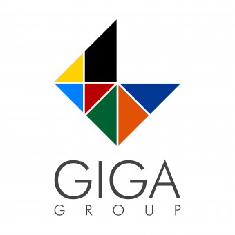
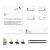
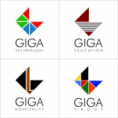
| DESIGN NAME: Giga Africa PRIMARY FUNCTION: Corporate Identity INSPIRATION: The group's dynamic approach to learn, explore and grow across diversified sectors stays the key inspiration behind the identity design. The logo unit comprises of tilted square which related to the dynamism of the group. The Square has further been opened up with a quarter triangle to learning, exploration and further complete it. The hunger to grow is visible with the missing fourth triangle. UNIQUE PROPERTIES / PROJECT DESCRIPTION: The Client expressed their interest of positioning their brand with a global appeal and dominance over african continent. GiGa stood for initials of the brothers name which hinted us on expressing a strong G as the symbol. Their hunger to grow across industries was noted and expressed with a open dynamic square which depicted their appetite for growth. The symbol also is an abstraction of African continent with colour picked from flags of the clients existing countries. OPERATION / FLOW / INTERACTION: The Group Logo developed further carries its DNA to the individual businesses which while following profile of the Logo Unit also reflects individual business to develop the visual connect. PROJECT DURATION AND LOCATION: The ideation started in April 2016 in Mumbai and was delivered to client by June 2016. FITS BEST INTO CATEGORY: Graphics, Illustration and Visual Communication Design |
PRODUCTION / REALIZATION TECHNOLOGY: The design was developed with a sketch of a square being tweaked and experimented. The idea to show a whole picture with smaller fragments which depicted the strength of the group in its diversity was intended. The afro flag colours were eventually picked for colour inspiration to highlight the groups presence in african continent. SPECIFICATIONS / TECHNICAL PROPERTIES: The Logo Unit is developed in a Square type tilted with the Font Taking its own space at the base creating a 2:3 style proportion for the entire visual unit. TAGS: Africa, realty, group identity, brand identity, corporate communication, corporate stationary, logo design, graphic design, zero9, prashant chauhan, anu chauhan RESEARCH ABSTRACT: Business Module of the group was studied and a fair shared the business portfolios was studied. The Group being present currently in 7 industries, were depicted in the group logo with modules of triangles. The African Roots were depicted by the identity picking the colours from flags of these countries. The Dynamic Open Square on the other end represents the adaptive and growing nature of the group, always hungry for more. Also the profile of the open square relates to the alphabet G which the Group Name begins with. CHALLENGE: Developing an identity our of a group with multiple business parallels and integrating them to form a DNA which would run through the individual identities of the sister companies was a creative challenge. The dynamic open square which also indicated alphabet G, was decoded to become the DNA of the group identity. This further was adapted to various businesses such as realty, healthcare, distribution, hospitality, education etc. ADDED DATE: 2017-01-19 06:01:03 TEAM MEMBERS (3) : Designer : Prashant Chauhan, Graphics : Anu Chauhan and Illustration : Chhaya Katalkar IMAGE CREDITS: Prashant Chauhan (creative director) Chhaya Katalkar (illustrator) PATENTS/COPYRIGHTS: Copyrights belong to Prashant Chauhan, 2016 |
||||
| Visit the following page to learn more: http://bit.ly/2iMC2uk | |||||
| AWARD DETAILS | |
 |
Giga Africa Corporate Identity by Prashant Chauhan is Winner in Graphics, Illustration and Visual Communication Design Category, 2016 - 2017.· Press Members: Login or Register to request an exclusive interview with Prashant Chauhan . · Click here to register inorder to view the profile and other works by Prashant Chauhan . |
| SOCIAL |
| + Add to Likes / Favorites | Send to My Email | Comment | Testimonials | View Press-Release | Press Kit |


